Who says a resort website design can’t be engaging and effective? When crafted with the user experience in mind, hotel web design can be quite effective at driving guests to take action. That action can be picking up the phone and calling in for a room or actually making a room reservation online. Such conversion metrics are critical in the hotel industry where travelers are looking to quickly book rooms online. A hotel’s website should be the property’s most important booking channel. Hotels are always looking for ways to increase online bookings and since not all hotel web design is created equal this is a perfect place to start looking. So prepare yourself for a visual vacation that will make you want to book your next getaway for real! When it comes to designing a website for a luxury hotel or a tropical resort, it’s all about visuals and smooth functionality. Guests want to catch more than just a brief glimpse of where they’ll be staying. They want to see the resort’s views and accommodations offered. If fine dining is available they want to salivate over the delicious cuisine and cocktail photos. Potential guests want lifestyle photography that allows them to really picture themselves at the resort before making a reservation.
We’ve spent some time reviewing several dozen resort and hotel websites from all around the world and wanted to share some of the essentials for creating impactful hotel web design. To be effective, the website must be beautiful and functional. Simple navigation menus, easy-to-find reservation buttons, and stunning – yes, stunning photography must be present. In addition, a touch of creativity regarding how the reservation process functions is also necessary. Here you want to focus on the user experience and make sure that selecting a room and paying for that room is quick and easy. Once again, the combination of web design and functionality are what ultimately sets a website apart from the rest.
Our resort website design review considered the following websites (from around the globe) to be very effective. They also provide excellent examples of web design and smooth functionality that provide visitors with strong visuals of the property and a great user experience. So pack your bags and prepare yourself for a visual vacation to some of the best resort websites and hotel web design on the Internet.
1. Terranea Resort
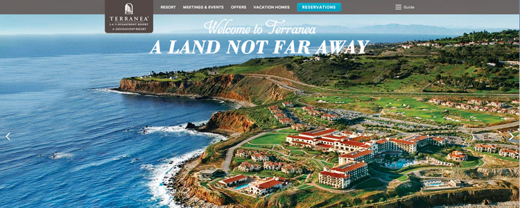
Terranea, LA’s oceanfront resort, seeks to transport you out of the city and off to its rocky and luxurious cliffs – and so does its website. From the informative yet gorgeous carousel images to the easily accessible reservations system and buttons, this beautiful website creates an air of sophistication and class that only an oceanfront resort in Los Angeles can offer.
2. Palacio Nazarenas
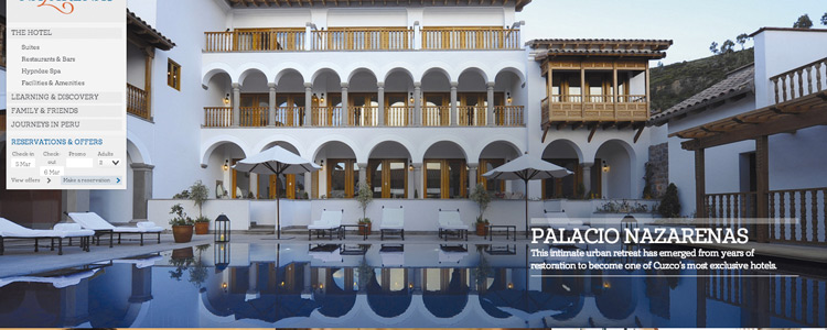
Utilizing parallax scrolling and animation, Palacio Nazarenas’ website design does a great job of helping guests visualize themselves at the property! As you scroll, the doors of the resort open to reveal the suite they’ve reserved for you. The rich colors, mixed typography, and vibrant resort photos all add to the effectiveness of this website design.
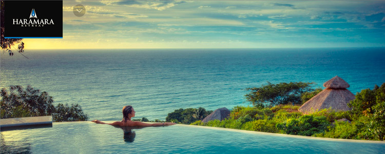
3. Haramara Retreat
Haramara Retreat’s website features spectacular visual tours of the resort – so spectacular that you can collapse the left-hand navigation menu for a full-screen resort tour. Each image is unique and takes you to a completely different view, showcasing the variety of vistas available to guests. When exposed, the navigation takes you deeper into the resort, revealing even more amenities and activities offered.
4. Villa Campuhan
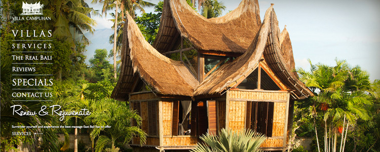
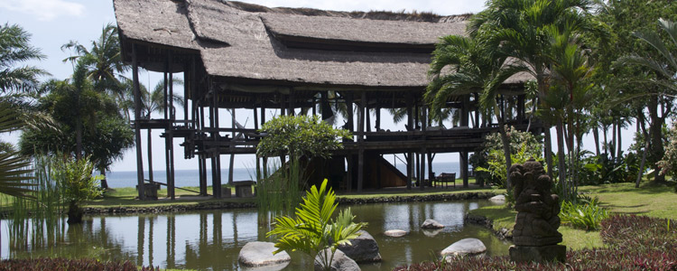
Villa Campuhan’s simple navigation and custom fonts – not to mention its spectacular showcasing of the resort’s grounds, are what make this website design a favorite (yes we also did the web design and development)! The white typography blends seamlessly with the rotating hero images, creating an easily understood navigation menu that doesn’t distract from the full-browser images. The homepage features stunning professional photography of one of the villas and the view is absolutely breathtaking. You can’t help but to imagine the incredible possibilities of an exotic and luxurious escape in East Bali. There is also no scrolling involved on this resort website design and the footer rises upon clicking to reveal the reservation form.
5. The Phoenix Belize
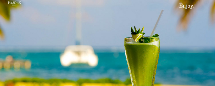
The Phoenix Belize’s website is comprised almost entirely of full-browser images for a truly visual user experience. The left-hand navigation window integrates in and out of view at the visitor’s discretion and the left and right navigation arrows on the right-hand side of the screen are easily accessible for viewing even more images. But perhaps it’s the use of simple white text with phrases like “Relax” and “Enjoy” that help potential guests believe that just by loading the page they are one step closer to a tropical weekend vacation.
