In a virtual sea of digital experiences, it can be challenging for brands to innovate and stand out both effectively and authentically. That’s why there’s such an impact when a brand’s marketing stretches past traditional methods and applies more fun, unique, and focused approaches. One unusually innovative tool for doing so—and one that such forward-thinking brands as Spotify, Nike, and Google use often—is the microsite.
What exactly is a microsite? Most straightforwardly, it’s a highly focused website featuring branded content to promote services, products, events, or campaigns. That said, this is only its essence: in practice, a microsite can be so much more.
A microsite has the capacity to be a space where brands experiment, innovate, and test out bold ideas that might not fit the constraints of a main corporate website—while still employing the same resources, time, and attention that go into that main website. Think of it like a major band’s side project, or a not-so-secret pen name that establishes an author in a new genre. Instead of being a brand’s calling card, a microsite can serve as a low-risk, high-reward avenue for new design trends and strategies, deeper audience engagement, and creative exploration.
There are myriad benefits to microsites, from their smaller scope and scale, to their specificity, to their bandwidth for bigger ideas and experimentation. And they can result in, among other outcomes, better audience engagement for a business. Sometimes, for extraordinarily well-crafted microsites, that engagement could even mean going viral, or becoming a cultural phenomenon. Of course, that’s not where the benefits end. Here’s what else you should know about microsites—and how they can make space for innovation, boost a brand’s online presence, and help any business break free from norms.
Taking Risks and Breaking Boundaries
First and foremost, microsites are essentially tailor-made for experimentation. Brands can use them to test drive new ideas, risky concepts, and unconventional designs, while avoiding unexpected impact or a reputational hit to the main brand identity or website. You can see this in the way many microsites break out from the typical confines of traditional web design. Outside of the corporate website structure, it’s much more likely for developers to use them to explore unconventional navigation, immersive narratives, and experimental content formats that prioritize engagement over conversion rates. Of course, ultimately, microsites do need to be able to drive purchases or measurably increase brand awareness, so these avenues of experimentation aren’t meant to dominate the experience—rather, the goal should be using them to enhance it.
That’s why, when you see elements like AI, augmented reality, virtual reality, or interactive video included in a microsite, they’re there to create a more compelling and immersive one-off experience. Such technologies might be considered risky when woven into a brand’s main website, but with a microsite, it’s almost expected that they would be explored and integrated—and create highly memorable engagement while doing so.

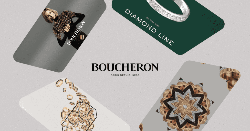
One notable gamification-centric example is Boucheron’s Quatre. Developed for the iconic product’s 20th anniversary, this interactive microsite couples an entertaining and immersive game with the history of the Quatre, using fluid and mesmerizing design, sound effects, and music to capture users’ attention. What’s most intriguing about this microsite is its ability to overcome the seeming clash between a jewelry brand and online gaming—it transcends the idea of that being a limitation, and instead combines the two, finding a place where smart, engaging campaign strategy meets user-friendly and surprisingly innovative engagement.
Encouraging Audience Collaboration and Co-Creation
The experimental side of a microsite isn’t a siloed effort—it’s something that can draw audiences to a degree that they become part of the brand’s story. The digital experiences within microsites can be participatory, whether that’s through gamification, user-generated content, polls, or social media integrations. Engaging communities in these creative ways has the potential to foster deeper and more lasting audience connections.
Spotify has a few excellent and memorable examples of fan-based microsites. A recent such example is the Spotify Astrology Club microsite, which builds off a resurgence of interest in zodiac signs to engage users. This colorful, compelling space creates a sense of community and interactivity, highlighting the personability and personalization inherent to Spotify’s brand.
Another is Adobe’s Creative Types, which encourages engagement through a personality quiz that features interesting, stop motion-esque design and animation, and results users can compare and share. Adobe already has a reputation for creative products, but this style of microsite actively reaches out to potential new audiences—people who might not yet see themselves as creative types. By offering a playful, insightful, and eye-catching space for engagement, Creative Types leans less on Adobe’s brand reputation and more on the sense of excitement, personalization, and innovation that made them so renowned.
Creating Cost-effective, Efficient, and Iterative Development
Some might assume that experimentation comes with a high cost, but microsites challenge that idea. Microsites are smaller scale makeing them accessible for companies with limited budgets and resources: because a microsite has less content and fewer pages, its development costs will be lower than that of a full website redesign.

A microsite can also act as a space for digital prototyping, allowing brands to track engagement metrics and user behaviors in real-time, and thus iterate and finetune elements at a faster pace. This expedited feedback loop is not just cost-effective—it’s also invaluable to product designers, marketers, and UX teams. Why? It allows them to test out product ideas, messages, and layouts before transferring them to a full-scale site. In that sense, they get to apply the experimental nature of a microsite to more logistical elements, which is advantageous when it comes to reducing costs, staying on budget, and choosing more effective design strategies.
Powerful Microsite Examples
One place you can see this in action is with nonprofits, smaller businesses, or indie film studios and music labels. For example, nonprofit organizations can use microsites for fundraising or events, and small businesses can advertise new products without using their entire marketing budget. Our team used this route to help private boarding school Tilton School in their marketing efforts, for one tangible example: the digital viewbook microsite served as an immersive tool that promoted Tilton School while inviting engagement with prospective students and parents.
With film studio A24 has used this approach for recent films like Civil War. The brand already demonstrates innovative creativity and explores the unexpected. The way this microsite couples a somewhat unusual idea with the serious topics of the film in question amplifies that reputation while showing that, even as A24 grows beyond its indie roots, there’s still a willingness to test and invest in ideas that would not work nearly as well for a more corporate film studio.
Build a Brand Innovation Laboratory via a Microsite
If you want your brand to stay ahead of the curve, consider how a microsite could serve not just as a campaign tool, but as an experimental hub. As a path toward greater freedom for your brand, developing a microsite gives team members permission to evolve, be more audacious, and find fresh perspectives. And it might just be what you’ve been looking for to help your brand transcend boundaries, ignite trends, and prototype that daring project that’s been lingering on the backburner.
Ready to pursue more consistent brand innovation? Start by partnering with a creative digital agency that shares your brand values! Our agency builds strategic microsites for all of these reasons and more—and can do so for any forward-thinking business looking to grow, transform or build a more authentic digital presence.
