Concept, Conversion Funnel, Customer Journey, UX / UI, Web Design, Web Development, Web Product, Responsive, Copywriting, Ongoing Optimization & Enhancements
 News Corp is home to some of the world’s most trusted brands, including Dow Jones, Harper Collins, and the New York Post. Isadora Agency’s expertise as a web development company allowed our team to build News Corp an internal benefits website that changed their employees’ views on benefits in a creative, refreshing way.
  Isadora Agency, a custom web design agency partnered with TravelStore, one of the top-rated travel management companies in America, to create a seamless website experience for travel connoisseurs. TravelStore crafts unique itineraries for vacationers looking to travel in style and personalizes superior corporate travel programs for a sophisticated clientele.
 Texas State Technical College
Overview
TSTC was established in 1965 as the most sophisticated technical-vocational institute in the country. Its mission is to help Texas meet the high-tech challenges of today’s global economy. To support all nine campuses, the website houses information about programs, locations and financial aid; announcements; and forms and legal documents.
Students, military veterans and professionals come to TSTC to gain skills to enter the job market, change careers, or improve their own lives and community. We immediately recognized how important the college is to these communities and used this to guide our work.
Information Architecture Services
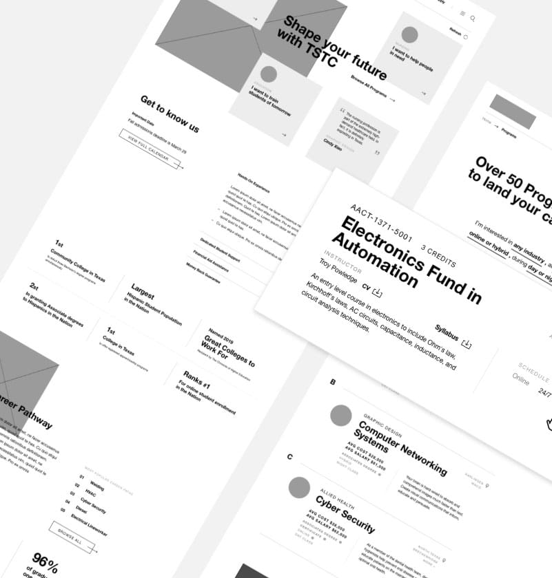
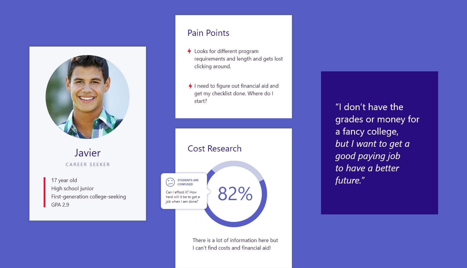
Our first step was to audit almost 20,000 website pages across multiple subdomains. Working from wide-ranging audience surveys, stakeholder interviews, and team collaborations, we drew up flow charts, user personas, and journeys. From this information, our team created a streamlined information architecture.
Student Behavior
Our research revealed that it was difficult for users to find answers to many questions, whether they wanted to select a career, explore financial aid, or apply for academic support. We focused our strategy and design on creating a seamless experience that presents relevant information in an easily digestible format.
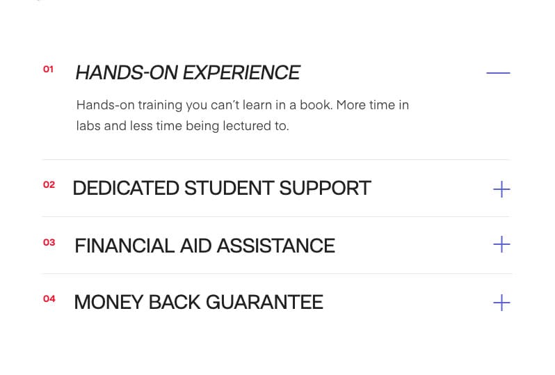
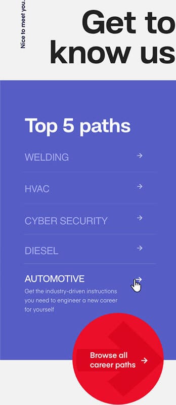

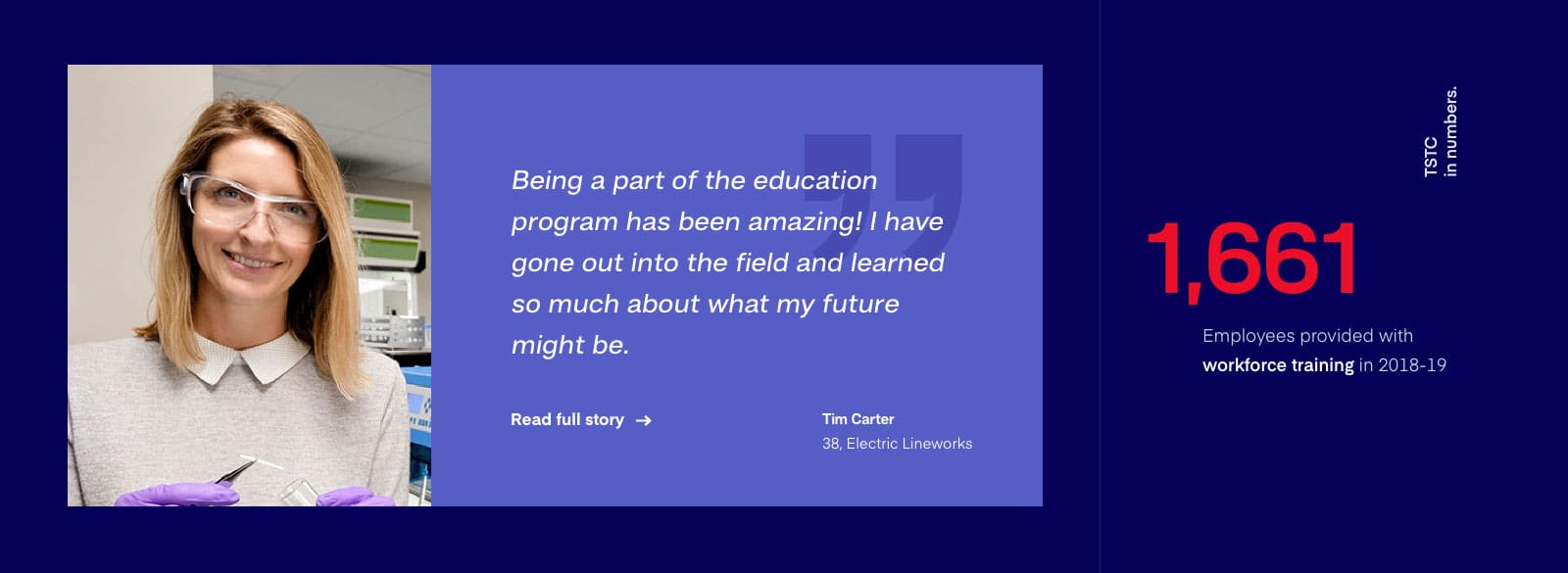
Innovative and passionate! As a result, it has been a true pleasure working with the TSTC team. Their commitment to their students shows in how they continually push the conventions of an educational site to bring awareness to life-changing career opportunities in the state of Texas.
Bold Design
The new TSTC homepage combines bold video and photos with aspirational messaging, prominent calls to action, and exploratory content to guide users. . Because most students know which TSTC campus they would like to attend, we made sure that the campus landing pages are also inviting and packed with important information.


Programs
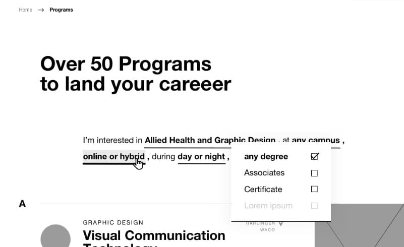
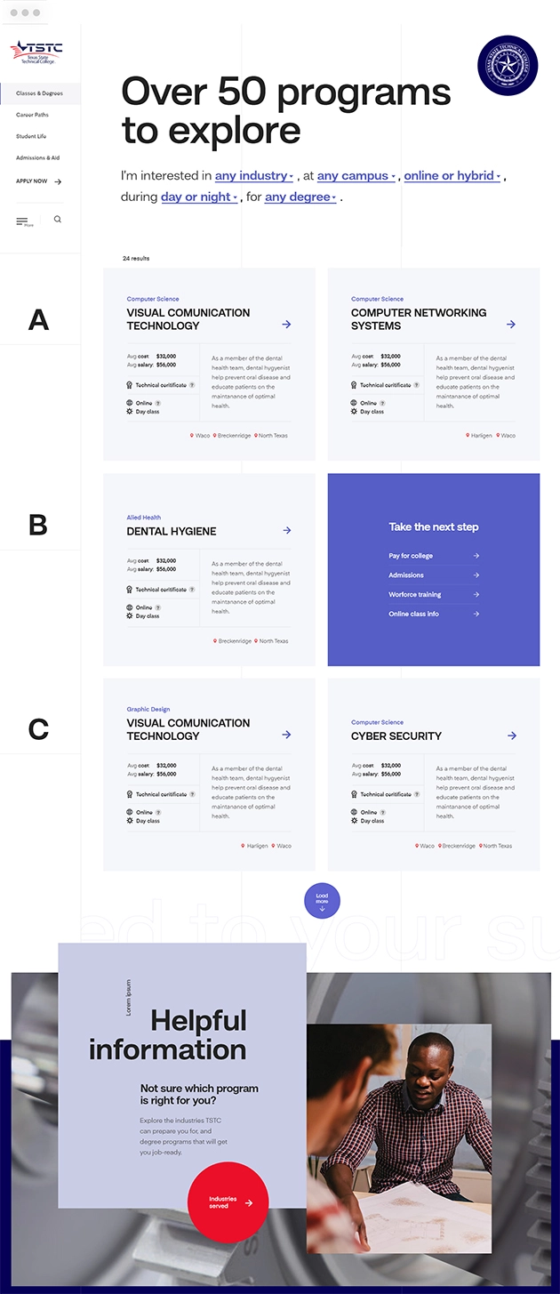
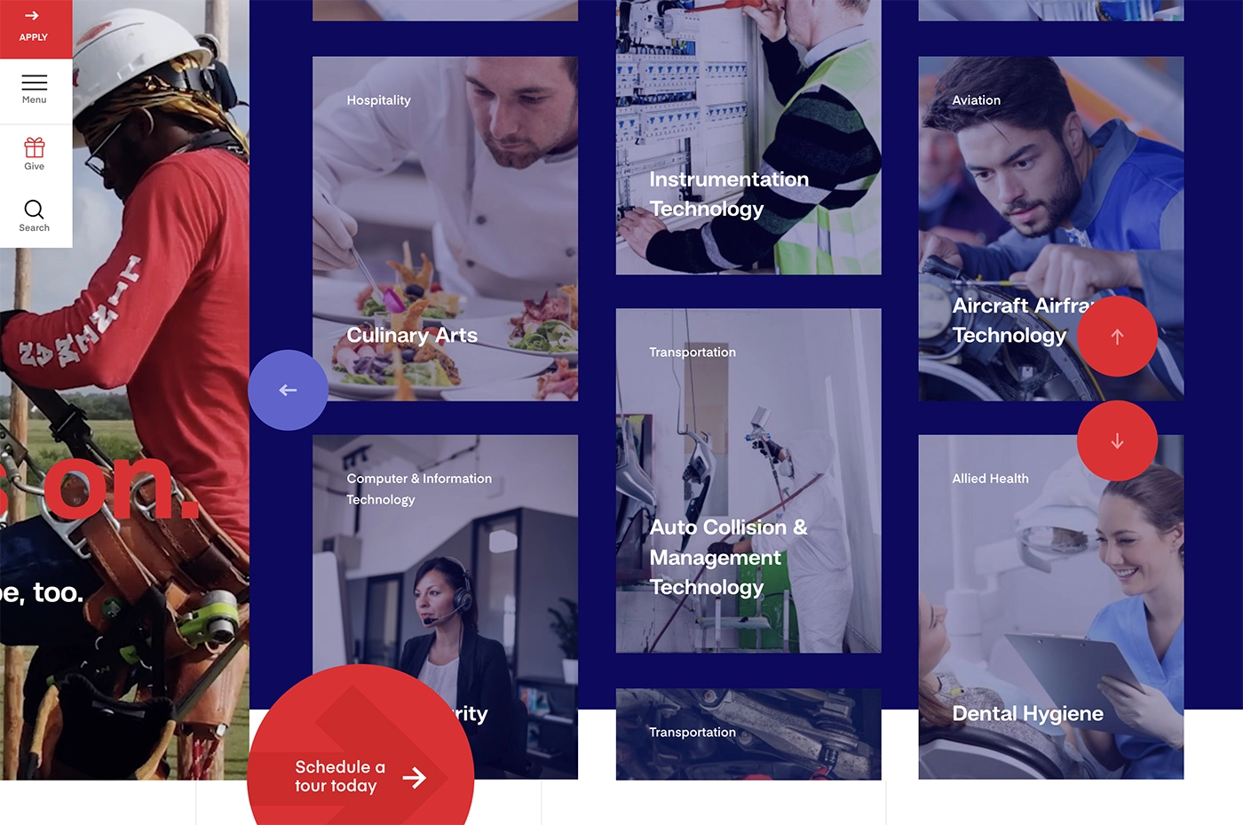
Firstly, the list of programs offers a robust filter option and a focused search tool that allows users to sort through dozens of courses in TSTC’s catalog. This makes it easier for students to find classes that fit their schedules and other criteria.
Programs
Firstly, the list of programs offers a robust filter option and a focused search tool that allows users to sort through dozens of courses in TSTC’s catalog. This makes it easier for students to find classes that fit their schedules and other criteria.

Campuses
Most students that apply know which TSTC campus they’d like to attend. So as a result, we made sure that the campus landing pages are inviting while having all of the needed details. These pages act as mini homepages in their own right.
Campuses
Most students that apply know which TSTC campus they’d like to attend. So as a result, we made sure that the campus landing pages are inviting while having all of the needed details. These pages act as mini homepages in their own right.


Focused Content
College admissions can be confusing so we wanted to make sure future students are fully informed before they apply. The redesigned admissions section offers statistics and content clearly divided by the target audience so users can get what they need quickly.
Focused Content
College admissions can be confusing so we wanted to make sure future students are fully informed before they apply. The redesigned admissions section offers statistics and content clearly divided by the target audience so users can get what they need quickly.


Redesigned Search
Since the website is an information clearinghouse, we created two new search functions. First, an inclusive sitewide search tool was a must-have. We paired smart content recommendations with a segmented results page to make sure viewers always find what they are looking for. Then, with a program listing that has dozens of programs to choose from, we paired a robust filter with a focused search tool to streamline search results. This helps users easily find the classes that meet their criteria.
MOBILE EXPERIENCE
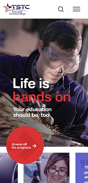
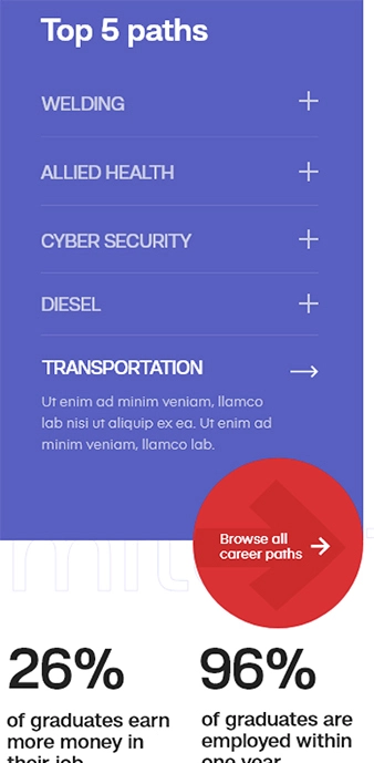
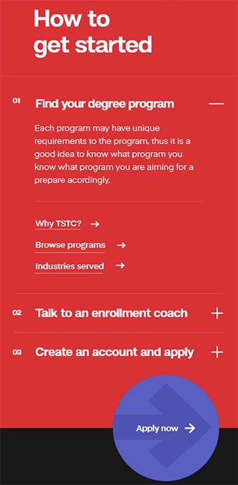
Students are more likely than other user group to use their mobile devices to view the web. Therefore, the mobile view had to be as strong as the desktop version without losing any functionality. We made sure the site looks better on a phone than on any other device.
