With so many competitors crowding the marketplace, Razor was finding it difficult to distinguish its value to consumers and keep them informed about its ever-expanding range of products and accessories. Furthermore, without full catalog eCommerce website design capabilities to support direct sales, shoppers were finding little reason to visit the website, let alone to build the kind of brand loyalty that leads to repeat sales. Here’s how our digital agency changed everything.
They hit on everything we wanted, and I recommend them wholeheartedly. (Danny Simon, COO, Razor USA)
Homepage
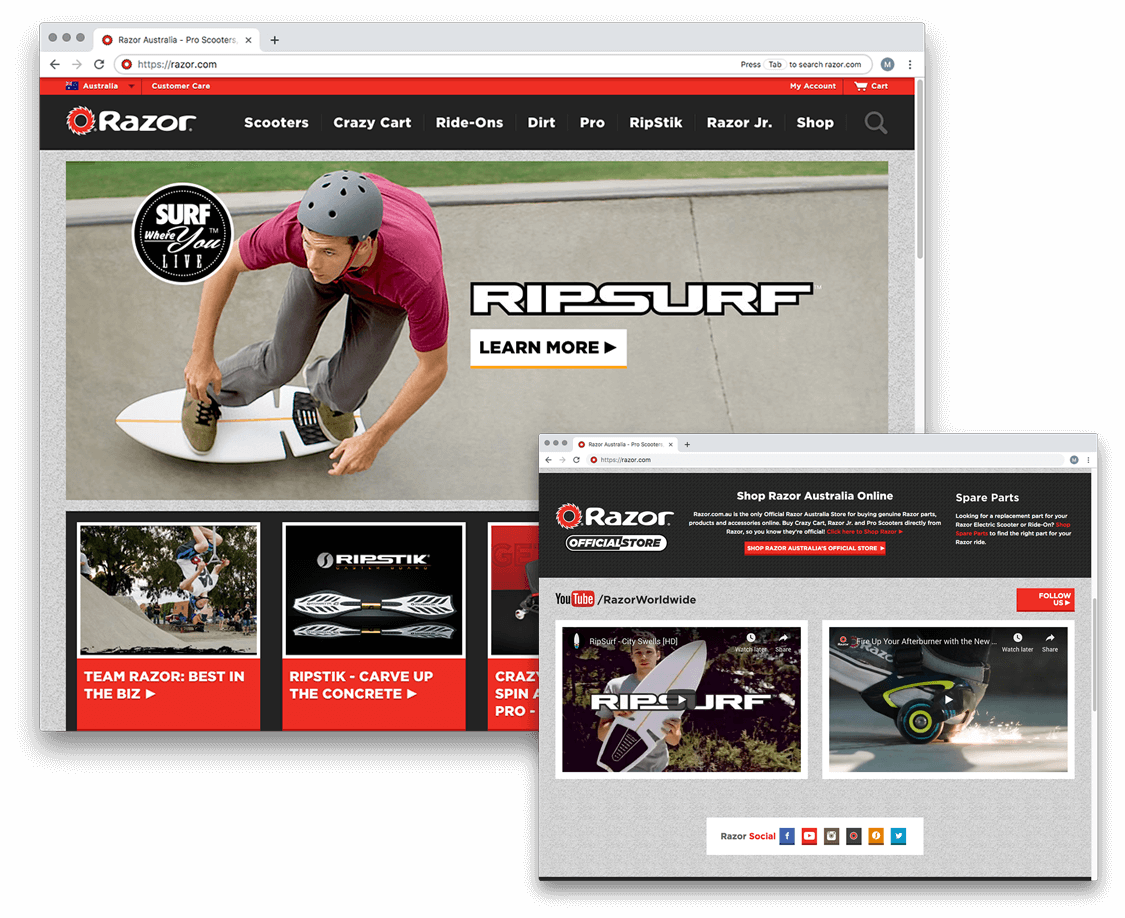
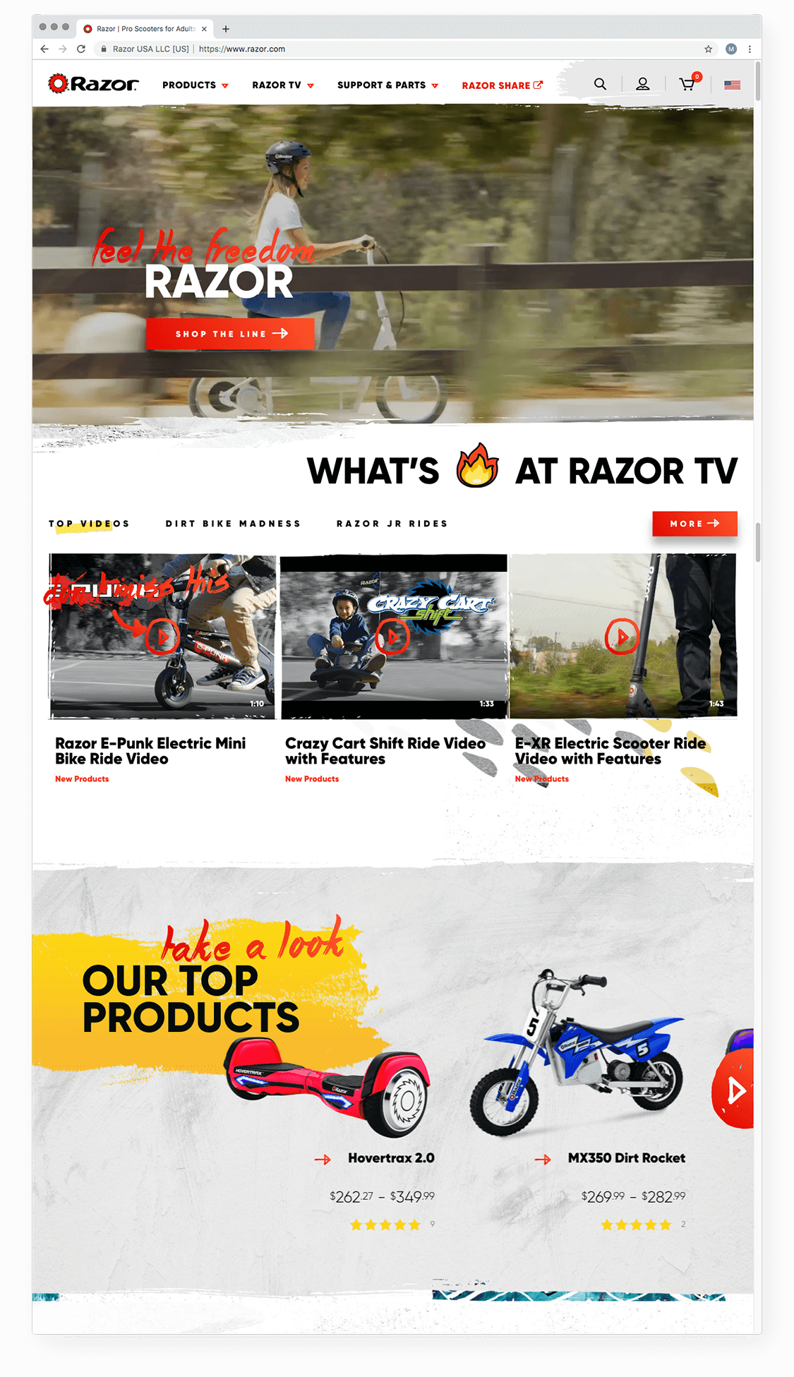
Before, Razor’s homepage was dark and cluttered, with too many calls to action and a lack of focus. For such a well-known and iconic product line, we knew the eCommerce web experience had to blend effortlessly with the visual design. You’ll also notice that we introduced a light color scheme accented with street-style elements that accentuate each awesome ride.
Before
After
eCommerce Website Design – The Product Page
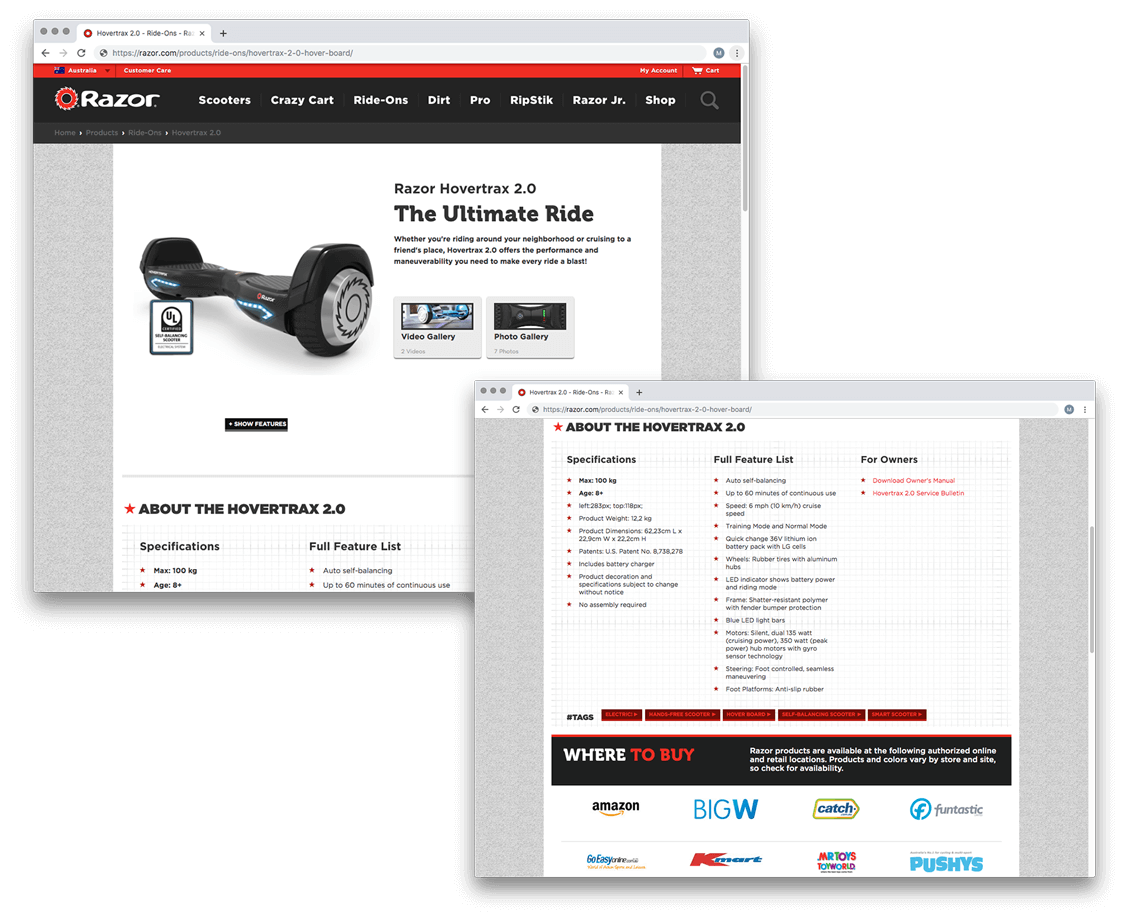
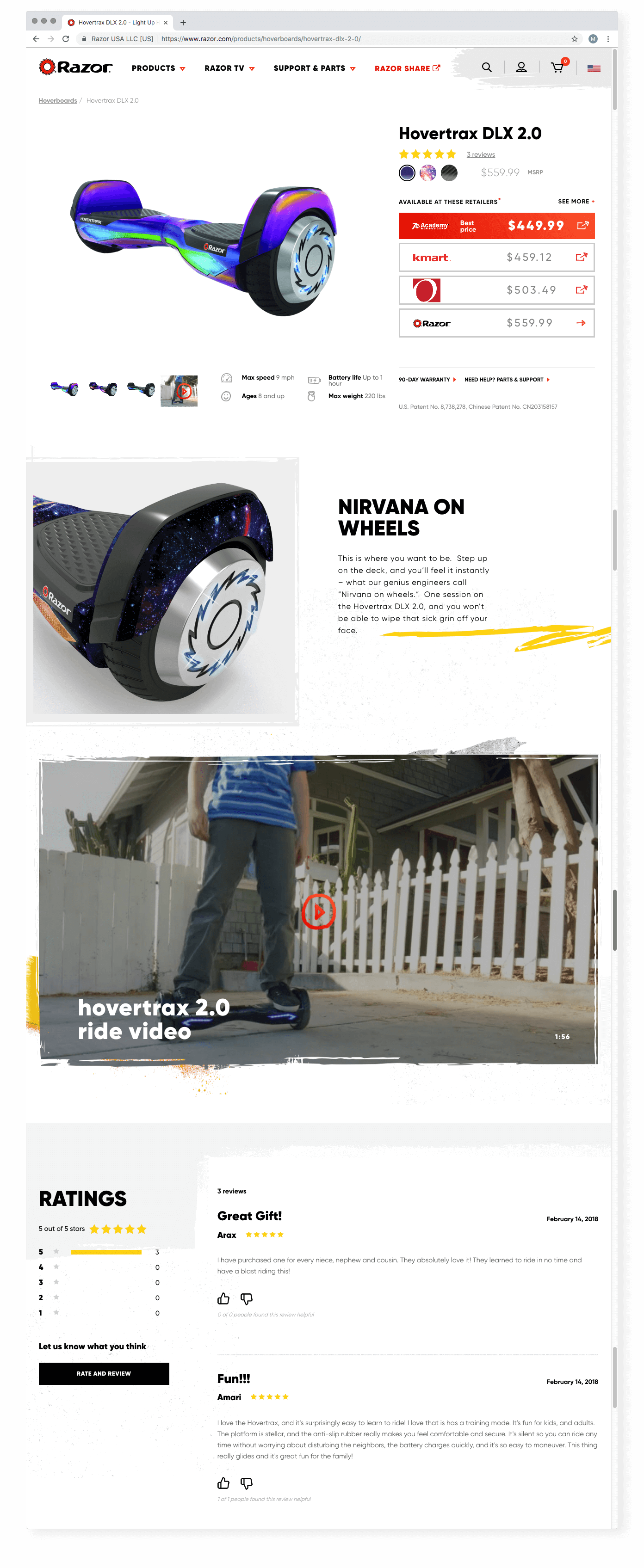
The cornerstone of Razor’s new eCommerce website design is the new product page. This key page highlights the range of customizable features each product has, as well as the wealth of buying options available to the customer. Now, product thumbnails, colorways, reviews, tech specs, and pricing details are all available above the fold.
Before
After
Customer Support
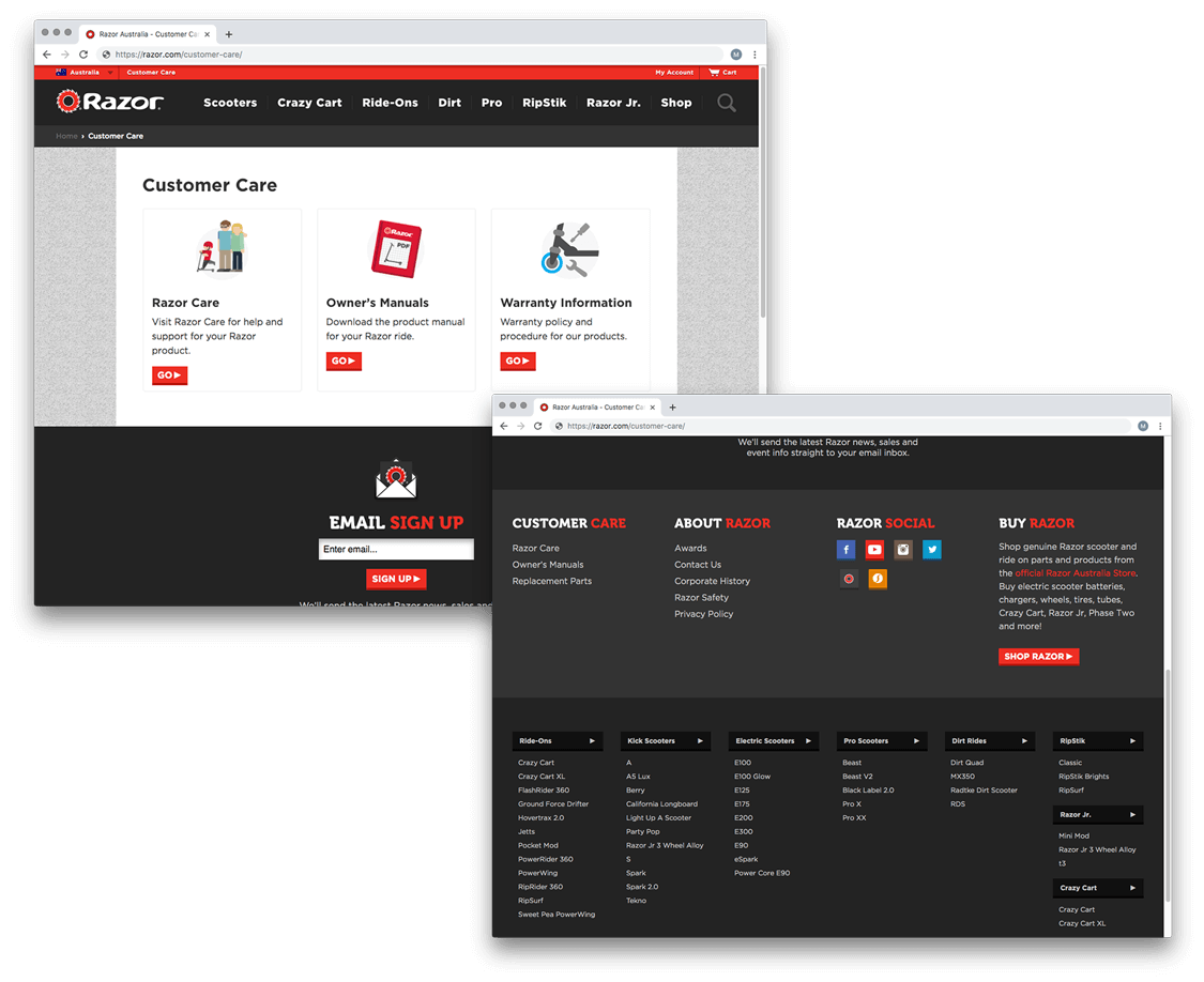
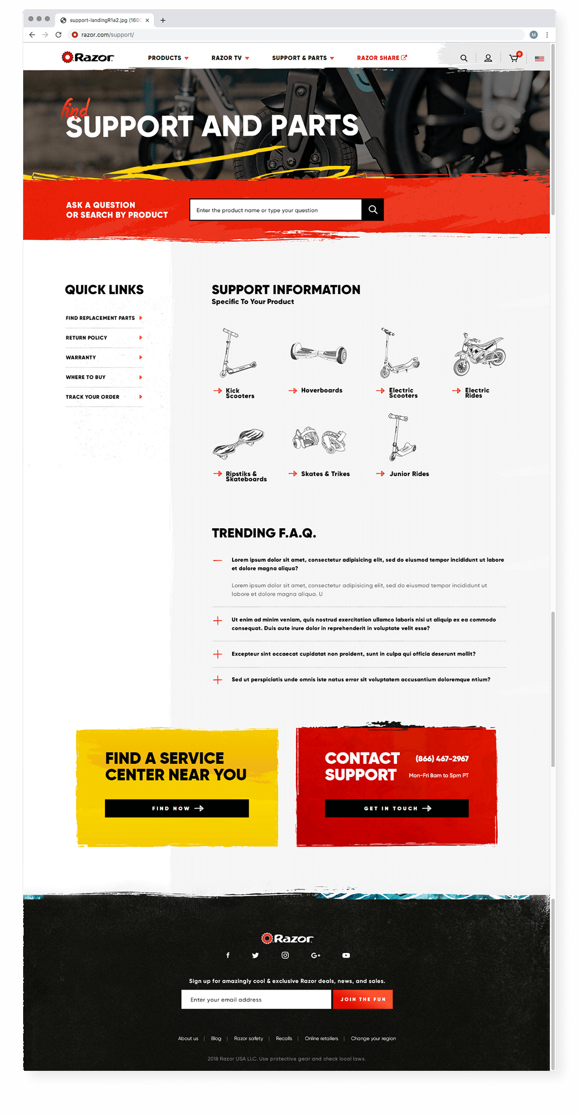
With legions of loyal returning customers, support for an eCommerce website is paramount to a good product experience. We overhauled this section of Razor’s site to allow customers to order replacement parts, find a service center, and reference product manuals, ultimately decreasing the number of users relying on phone support.
Before
After
These are just a few of the dozens of improvements we’ve made during our ongoing partnership with Razor USA. Since launch, we have continued to manage the eCommerce website to enhance the experience through analytics reviews, A/B testing, WCAG compliance, and website enhancements.

