Ecommerce website design for Popcornopolis brings high-quality, nostalgic flavors of popcorn to modern families on the go. A fast-growing leader in the CPG space, Popcornopolis needed its eCommerce website to keep up with increasing demand from devoted fans for tasty gourmet snacks, gift sets, and holiday assortments.

Summary
Popcornopolis
Article Name
Popcornopolis
Description
Ecommerce website design for Popcornopolis brings high-quality, nostalgic flavors of popcorn to modern families on the go.
Publisher Name
Isadora Agency
Publisher Logo

Tilton School

An empowering, exploratory learning environment brought to life online. Isadora Agency partnered with New Hampshire-based Tilton School to build the student community with a fresh, dynamic digital viewbook.

Popcornopolis

Ecommerce website design for Popcornopolis brings high-quality, nostalgic flavors of popcorn to modern families on the go. A fast-growing leader in the CPG space, Popcornopolis needed its eCommerce website to keep up with increasing demand from devoted fans for tasty gourmet snacks, gift sets, and holiday assortments.

Brookfield Residential

Homebuilder Brookfield Residential teamed up with Isadora Agency for extensive UX and digital product design to boost engagement and lead generation. New features and tools were created to showcase Brookfield’s stunning communities more effectively. As a result, user interactions grew significantly, generating thousands of contact form submissions.

NCCER

Isadora Agency recently worked with the National Center for Construction Education and Research (NCCER). An educational nonprofit dedicated to craft professionals’ career development; NCCER needed to transform their brand. We achieved that goal by creating a powerful website design and visual identity to match.

Upli

Could employers dramatically enhance employee financial wellness through a feature-rich mobile app design?  Discover how our agency's comprehensive design solved this Fintech challenge through highly interactive tools and a sticky experience essential for frequent user engagement.

Kelley Blue Book

A household name since 1918, Kelley Blue Book, needed to attract modern customers and younger audiences. KBB was looking for a fresh new experience that targets a generation of savvy, online car shoppers while remaining approachable to legacy users.

Razor USA

Razor is a leading personal transportation brand;  it brought scooters out of the attic and put them on sidewalks across America. When Razor needed to up their sales game, they approached us for eCommerce website design and development. We gave this iconic youth brand a hip upgrade that inspired a whole new audience to want to take Razor for a spin.

News Corp

  Webby Badge V2 News Corp is home to some of the world’s most trusted brands, including Dow Jones, Harper Collins, and the New York Post. Isadora Agency’s expertise as a web development company allowed our team to build News Corp an internal benefits website that changed their employees’ views on benefits in a creative, refreshing way.

The Honest Company

The Honest Company partnered with Isadora Agency, a premier eCommerce web design agency, for facilitating the brand's online sales of baby and beauty products. The new aesthetic is a blend of utility and minimalism. See how we incorporated innovative features and design elements that enhance all beauty and baby products.

Sunbit

In short, Sunbit is a financial technology brand that required a web design company with deep expertise in creating various web products and dashboard design. Therefore, the brand’s growth gave our teams an opportunity to revitalize and create all-new modern marketing and mobile app tools.

TravelStore

Isadora Agency, a custom web design agency partnered with TravelStore, one of the top-rated travel management companies in America, to create a seamless website experience for travel connoisseurs. TravelStore crafts unique itineraries for vacationers looking to travel in style and personalizes superior corporate travel programs for a sophisticated clientele.

California HVIP

The Hybrid and Zero-Emission Truck and Bus Voucher Incentive Project (HVIP) is an important California initiative. Isadora Agency partnered with HVIP for a comprehensive digital transformation. The scope included a website redesign and new content strategy, to boost user engagement and effectively deliver critical program information.

Belkin Business

Most importantly, guiding the way partners and staff perceive and engage with the brand design. On the other hand, aligning business and consumer verticals, highlighting differentiators, and reclaiming leadership.

Palm Bay International

An industry leader with the most comprehensive portfolios of imported wines and spirits. See how we developed powerful generators and sales tools to facilitate new B2B business.

LiveNation

The world’s global leader in live entertainment. You can just imagine our digital agency’s enthusiasm when Live Nation tasked us with creating an interactive website design & marketing campaign. Live Nation’s summer concerts were about to get personal and sharable via millions of fans across social media.

Virco

Most Importantly, Virco has supplied quality furniture for America's K-12 schools since 1950. Therefore, discover how our digital agency achieved a beautiful balance of robust client utility and brand positioning alignment in this custom web design.

Barnum by Mass Mutual

Barnum Financial Group is an award-winning network of independent financial planning and wealth management advisors. As an experienced B2B website design agency our user experience team cracked the formula for uniting independent advisors under a single digital destination for financial and wealth management, increasing adoption and conversion nationwide.

UE by Logitech

We’re all made to love music. Professional website design agency, Isadora Agency partners with Ultimate Ears to create a rich and interactive experience, you can almost touch it.

PowerSchool

PowerSchool is improving the K-12 educational experience with over 100 Million users in 70 countries. Learn how our digital agency empowered users while giving the brand a powerful interactive web product.

Beast Academy

Providing a comprehensive curriculum that is both rigorous and wildly entertaining. Learn how our collaboration with Beast Academy took critical reasoning and advanced problem solving to all new levels.

The Honest Company

The Honest Company partnered with Isadora Agency to enhance its e-commerce product lines and subscription program. Providing parents with clear options and ease of use created an accommodating, values-friendly experience that improved customer engagement and retention.

Hilco Global

Hilco Global, a financial services company with numerous subsidiary operating companies, excels at asset valuation and maximizing returns. Isadora Agency led Hilco Global through an extensive digital transformation, resulting in a new, refined website and dynamic brand presence.

Texas State Technical College

Information architecture services were one of the numerous service categories our agency focused on for Texas State Technical College (TSTC). Above all this was to help Texas meet the high-tech challenges of today’s global economy. Learn how our team took an informational clearinghouse and transformed it into an effective student-focused marketing platform.

Martinkovic Milford

A brand that pushes boundaries through forward-thinking architecture. Learn about how we inspired both B2B and B2C prospects while increasing qualified lead generation.

Report by Steve Madden

A revolutionizing eCommerce shopping platform for one of the most iconic brands in footwear, sold in over 80 countries worldwide. See how our team developed a robust social and interactive experience targeted at female millennials.
Back

Popcornopolis

Ecommerce website design for Popcornopolis brings high-quality, nostalgic flavors of popcorn to modern families on the go. A fast-growing leader in the CPG space, Popcornopolis needed its eCommerce website to keep up with increasing demand from devoted fans for tasty gourmet snacks, gift sets, and holiday assortments.
Scroll down

Overview

Popcornopolis is a forerunner in the world of gourmet packaged popcorn, driving demand for sweet and savory treats among consumers who want the most consistent, high-quality products available with timeless premium flavors. The brand needed to modernize its website shopping experience, giving users easy access to all their favorite flavors, as well as flexible options for creating their own assortments for gifting to others or keeping for themselves. We helped Popcornopolis rethink their product organization from the ground up, devise shopping options that serve all kinds of popcorn enthusiasts, and show visitors how Popcornopolis can sweeten up all of life’s special occasions, big and small.


Services

Concepting, Consumer Research, UX/UI, Web Design, Motion Graphics, eCommerce website design, eCommerce Development, ERP Integration

Imagery & Typography Details

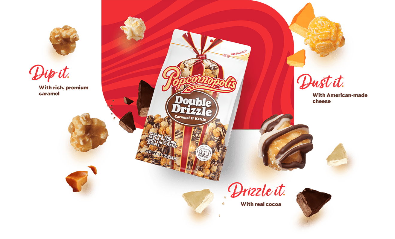
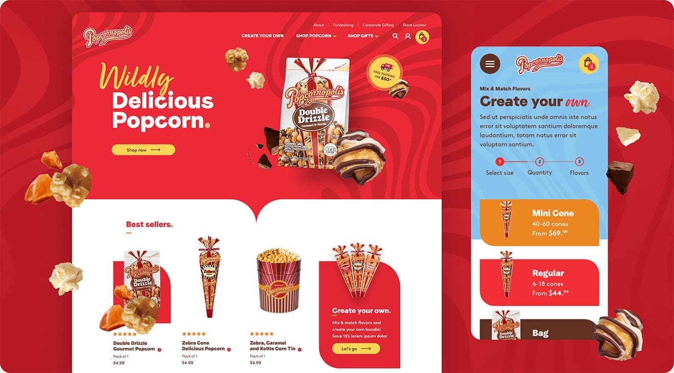
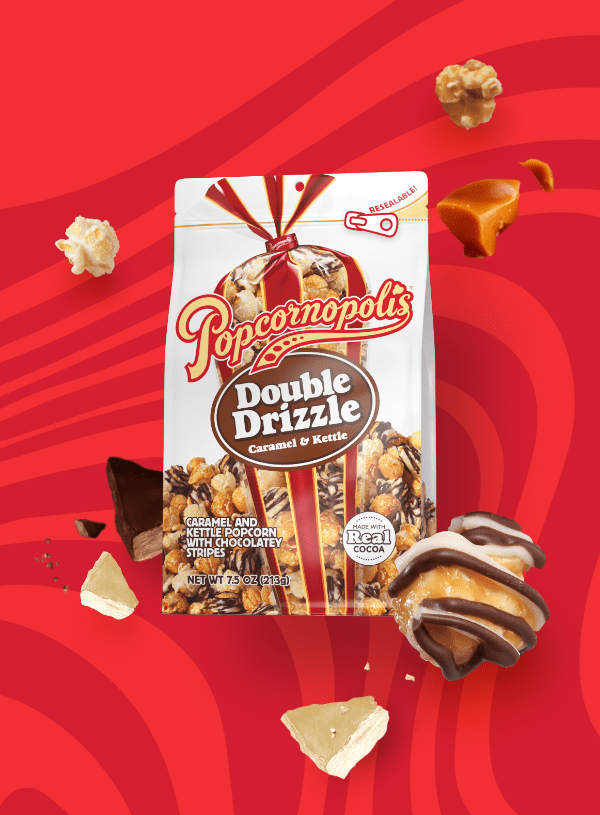
To help Popcornopolis transition its brand image from a more traditional, American heritage brand to one hipper, more colorful, and more attractive to indulgent and ingredient-conscious snackers alike, we introduced patterned color blocks and cutout close-ups of their 100% real ingredients. Script headings and a bold sans-serif pair to inject personality while maintaining legibility.

Design Elements for Popcornopolis Site

We are extraordinarily grateful for the time your team willingly gave and still gives to help us propel this brand and business unit forward.

Yvette Justice
Yvette Justice
VP | Ecommerce

Ecommerce Website Design Strategy

Isadora Agency audited every page of Popcornopolis’s existing website, interviewed an array of employees, and even sought input from customers before drawing up a revised information architecture that put Popcornopolis’s best features first. We led with the flexible buying options that customers find most useful, and restructured product categories to create a truly shopping-first experience that makes it easy to find the snacks you crave.

popcorn moodboard and color scheme Popcornopolis Wireframes
Popcornopolis Sitemap

It’s always rewarding to collaborate with a team that is passionate about their products. The Popcornopolis brand is all about elevating everyday moments and their team’s enthusiasm really helped us bring that joyful energy to the forefront with a site experience that feels bright and indulgent.

Carina Lora Daniel
Carina Lora
Senior Digital Producer

GLOBAL STYLES

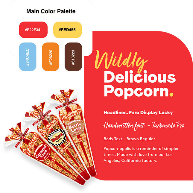
To complement Popcornopolis’s new packaging and retail strategy, we introduced a fresh, bold new color palette that builds on classic, recognizable colors, and echoes tones of their most popular flavors. The result is a vibrant, versatile, cornucopia of color that draws the eye without overwhelming the screen.

Popcornopolis Main Color Palette popcorn flavors
banner wildly delicious popcorn
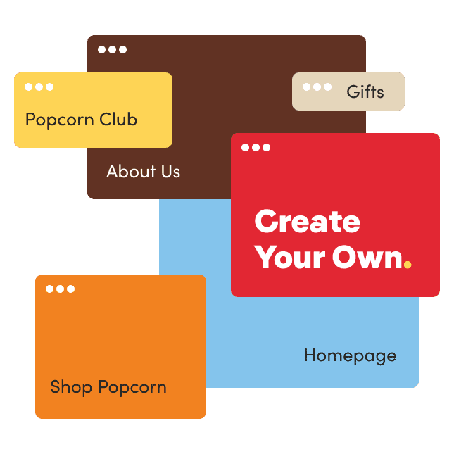
popcorn trio Create your own popcorn basket

Homepage

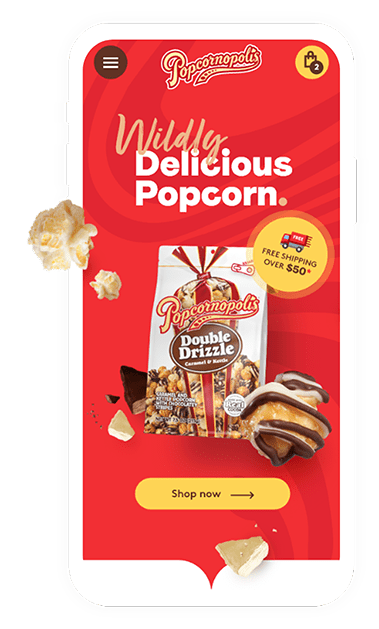
The new homepage hero gives pride of place to a single featured flavor at a time, allowing Popcornopolis to highlight their hottest new formulation, a bestseller, or a seasonal favorite. The background changes to complement the flavor, packaging type, and ingredient elements, creating an enticing experience for every new user.

Popcorn homepage design patterns Popcorn homepage design patterns

Product Detail Page

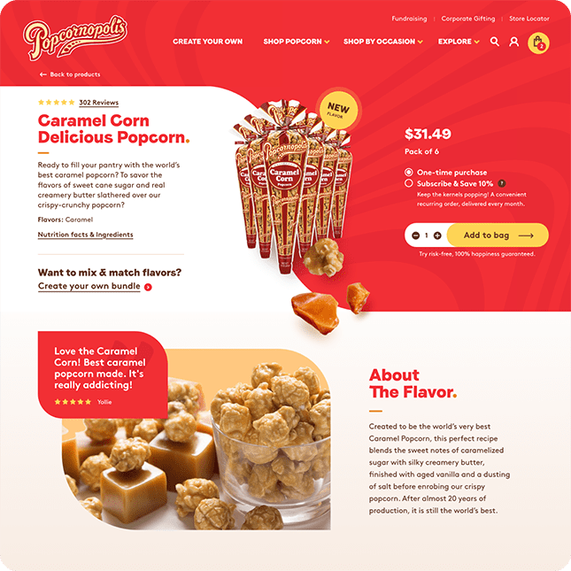
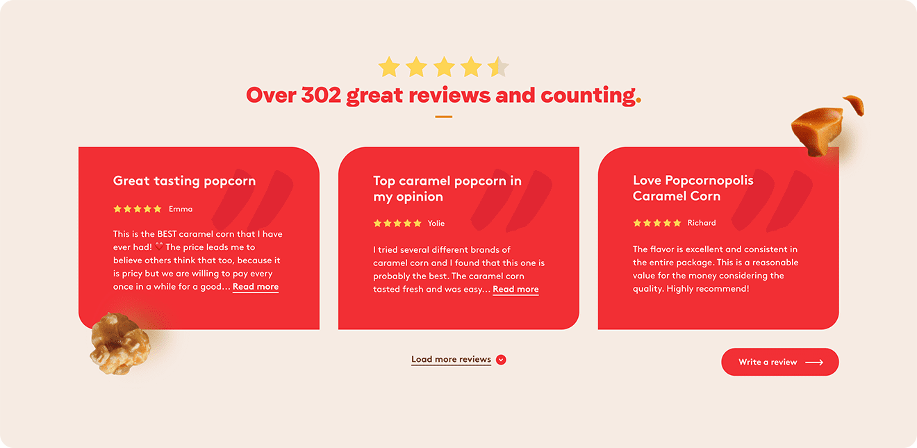
Our aim with the product detail page was to give the user all the information they need to make a purchase without asking them to scroll down. A large silhouette product photo shows you exactly what you’ll add to your cart, bolstered by user reviews and customization options directly in the hero section.

Popcorn product page design patterns Popcorn product page design patterns

Create Your Own

Popcornopolis customers know what they want, and the Create Your Own section gives them the freedom to customize a personalized assortment of their favorite Popcornopolis flavors, either to keep for themselves or to give to a loved one. The smooth step-by-step approach makes it fun to mix and match flavors, and builds excitement for the tailored box set to arrive at their doorstep.
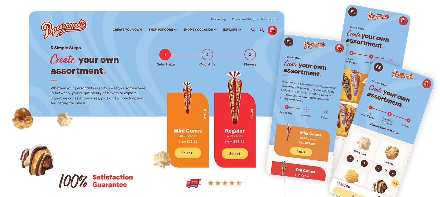

Create your own popcorn basket page design Create your own popcorn basket page design

MOBILE EXPERIENCE

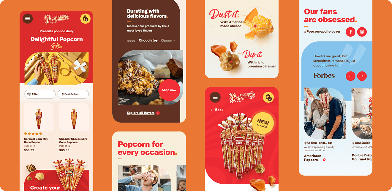
We know a majority of Popcornopolis shoppers visit the site from their phones while on the go or even in store aisles. The site is made to perform just as well–or even better–on mobile browsers as on desktop; shopping remains as efficient as ever, so users can find what they want fast and enjoy their favorite Popcornopolis flavors as soon as possible.

double drizzle popcorn in mobile layout
caramel corn popcorn in mobile layout
popcorn size options in mobile layout
See more
Tilton School Encouraging Enrollment through Authenticity Brookfield Residential Designing an Effortless Homebuying Experience