“The ability to simplify,” said artist Hans Hofmann, “means to eliminate the unnecessary so that the necessary may speak.” A quote like this holds weight in so many contexts, and when it comes to dashboard design, it’s especially relevant.
Data visualization
Data visualization dashboards have revolutionized the way all of us interact with the world and information in particular. In the world of web design, this is apparent. And yet, you could consider—as a more widespread example—the typical weather app on a smartphone. That’s a straightforward example of data visualization that the average person uses fairly often. It has several features that are common to other kinds of dashboards—and, notably, that align with what are widely considered to be best practices.
What are those best practices? What makes a data visualization dashboard effective? How do you combine the need for quality information with eye-catching design, and reach your audience in the best possible way?
Present Effectively
Good dashboard design starts with displaying information clearly. This is where simplicity first enters the dashboard design equation. It’s a guiding principle that helps you better connect with your audience. That means:
- Know your audience and the purpose. Every great dashboard begins with audience awareness. Be aware of who your viewers are, how well they know the data and subject matter, and what their needs are. If you’re not familiar with your audience yet, do some research and ask pointed questions about their priorities. A more thorough understanding of them means a more purposeful dashboard.
- Limit the number of views and colors used. Avoid overwhelming viewers by being choosy. Meaning, that even if you’re excited about your dashboard’s relevant views, it’s best to stick to a few that tell the story you want to tell. This goes for color as well. Too many will make it difficult to process or understand the information. Using color with a sense of simplicity will go a long way in conveying information with clarity.
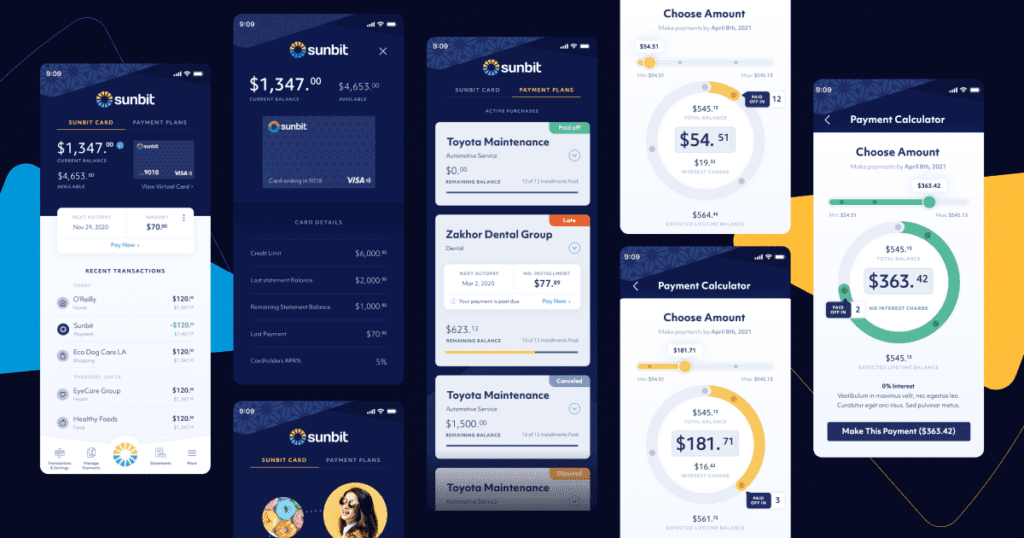
- Consider your display size. Be savvy to your audience’s preferred medium when building your dashboard. If they prefer mobile, for example, optimizing for desktop use is probably not the wisest move. Building off of that, remember that it’s generally a good rule of thumb to stack content vertically, to optimize for phone screens.
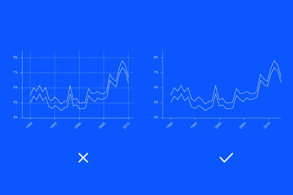
As you can see, simple doesn’t mean basic. It means straightforward, understandable, and clear. And clarity goes a long way toward connecting with your audience.
Make it More Engaging
Once you have a handle on your dashboard’s clarity and simplicity, engaging your audience is the next point of focus. How do you capture users’ attention—and keep it? Here are a few tips:
- Pay attention to layout order. Creating an effective dashboard design begins with being attuned to visual hierarchy. Using a largest-to-smallest workflow will carry users along as they move through the dashboard. It’s also helpful to place the most important view in the upper-left corner of the dashboard, so you can then build out a sequential path that users’ eyes will naturally follow.
- Add interactivity to encourage exploration. Setting up your dashboard with filters that allow for quick analysis is an incredibly effective way to do this. You can also use filter cards for different kinds of data. From multi-select checkboxes to dropdown lists, there are several options that will streamline your viewers’ data interactions.
- Use clear labels and tooltips. This is a fantastic way to reinforce your story and give it context. It also keeps the rest of your dashboard clear, since users can get the rest of the information they need by hovering over certain points in the data visualization rather than searching through it.
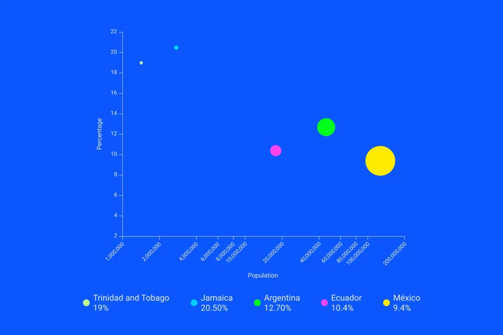
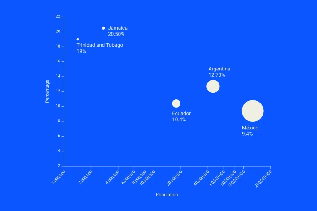
- Make it accessible. Accessibility’s importance cannot be overstated for several reasons. Ethically and legally speaking, it’s necessary. But it’s also good for your business and it generally leads to better design. You can achieve this through, for example, clear descriptive text, and accessible, contrasting colors. Also, consider whether adding motion and audio would be a benefit. While these elements can be overwhelming in some formats, at other times, elements such as animation are perfect for reducing cognitive overload and presenting data in an accessible way.
A Setup for Success
After you’ve addressed your dashboard’s engagement needs and visual hierarchy, you want to ensure that it will perform well. For that to happen, you need to:
- Be consistent. A great dashboard will convey information in a consistent way, which means the visuals align in terms of layout, content, and organization. This isn’t the place to get experimental or unpredictable—that’s a way to lose your audience.
- Test for usability. Is your dashboard accomplishing what you want it to? Does it convey information effectively, clearly, and in a way your users can understand? If you’re not sure, ask your audience. How are they using the dashboard? Is it helping them answer their questions? Use the responses you get to refine the current dashboard or to create a new one.
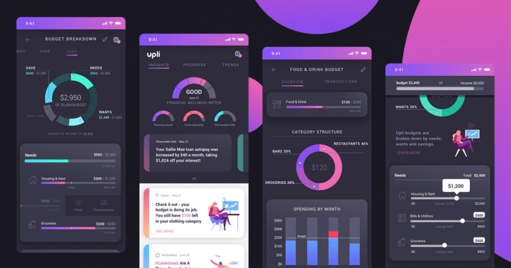
Envision a Better Dashboard
It’s important to keep these principles close at hand. And when you remember the big-picture purpose behind a dashboard of saving your audience time and effort, you’ll almost naturally tend toward these best practices. Remember that it’s all about meeting your audience’s needs, through a simplified version of complex data. When you design with that in mind, you’ll be able to stay on the right track.
