You probably already know that a landing page, true to its name, is a standalone web page where users arrive after clicking a link from an email, Google search, or social media post. And we probably don’t need to remind you that they are often connected with digital campaigns. Or that they provide users with singular focus that regular web pages don’t. Instead of sending users to your business’s website, they direct users to a targeted lead generation page, which lets them take quick action.
All of this is why a landing page is an excellent way to increase your marketing campaigns’ conversion rates, and lower the cost of acquiring leads. But did you know that landing pages have more potential than that? Really—they can be a fantastic medium for creative storytelling, and for sharing your brand in new, clever ways that capture user attention. Which, of course, is another step toward getting the leads and conversions you want.
Here are a few key ways you can transform a basic landing page into its best, most lead-generating version of itself.
1. Start with Your Unique Proposition
Set clear expectations for customers by defining your unique selling proposition (USP). This is where you emphasize what makes your business stand out, and why it’s where customers should fulfill their needs. This doesn’t have to mean getting complicated, elaborate, or flashy. Instead, focus on making your message clear, unique, and authentic. Show customers that your brand is distinctive from competitors, and make it clear why they should choose it. This sets you up to make a real connection with them.
And a great landing page sets this up quickly and deliberately, from the main headline. Netflix is one great example of a company doing this well. The leading streaming service obviously knows how to acquire and keep subscribers: with an unbeatable value proposition like you see here. That’s the sort of straightforward USP that keeps customers from leaving and going somewhere else. It also gives them a reason to want to learn more about your business. When they understand your USP—and encounter it throughout the landing page—it motivates them to learn more about what your business can offer them.

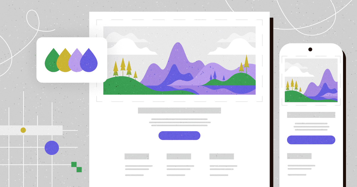
2. Draw Users in through Purposeful Design
Once you’ve captured your customers’ attention, the next step is keeping them engaged. And a landing page with confused, cluttered design doesn’t do much to accomplish that. An effective landing page makes use of clean design that hones in on a single conversion goal. So be sure to keep distracting elements and unnecessary links out of the equation. Even linking back to your home page can be too much.
Instead, design for visual simplicity, with minimalist elements and purposeful use of color. This draws customers’ attention directly to important information. And it keeps them in the flow enough to actually continue reading. Consider the design of the Calm app’s landing page. Its simplicity is soothing, which is true to its brand, and swiftly invites users into a digital space that mimics the pleasant experience of using Calm.
You should also ensure that your design is responsive, with device-specific variations. A lead generation page that isn’t mobile-friendly risks pushing frustrated users toward one of your competitors. User-friendly design will help you avoid this situation, and encourage meaningful engagement.
3. Use Copy that Really Clicks
Don’t underestimate the power of copy that resonates with users. The language your landing page features doesn’t need to be over-the-top or ornate—and in fact, it shouldn’t be. Concise, emphatic copy is the kind that speaks to customers. It’s more readable, for one thing. It also coheres more easily with design elements (without, of course, adding clutter).
You can say more with less by being selective about words and phrases. Choose brand-specific language, and be descriptive but to-the-point. That will keep customers rapt while still appealing to their receptivity. For an example that packs a punch, check out the Mortal Kombucha landing page. This Boulder-based beverage company keeps it simple, ties in a dash of wordplay, and grabs attention with a bold phrase that immediately communicates the brand’s purpose. And while it hits hard, it’s not overly wordy—it explains just enough to keep users invested and engaged.
4. Make it Memorable with Benefits and Calls-To-Action
An effective landing page includes succinct benefits and a powerful call-to-action (CTA). Customers should know what they’ll gain from engaging with what you have to offer. When you vividly describe your products’ standout qualities and your business’ unique offerings, it gives people a clearer picture of how engaging with your business can improve their lives. One powerful example of this is by online money transfer service Wise. This landing page leads with boldness and clarity to share Wise’s main service offerings and benefits (“Pay and get paid globally. Move money where it matters”; “High speed, low fees”). It’s engaging, and inspires customer action without overt pressure.

Likewise, your CTA should be straightforward but inviting, focused on one conversion goal. After all, its sole purpose is to compel customers to take the next step with your business. Whether your landing page’s CTA is a standalone button, click-through page, or form designed for a lead generation page, it will be more effective if it is central, specific, and bold.
5. Share Powerful Social Proof
When you acquire new customers, you build new relationships. Social proof goes a long way to help your landing page accomplish this. Try featuring testimonials, quotes, social media posts, and stories that highlight others’ purchases. This can make people far more likely to engage and convert.
Why? Consider that the average customer actually reads at least 10 reviews—and spends nearly 15 minutes reading customer feedback—before deciding to trust a business or make a purchase. So it’s important not just for your business to have a strong track record of customer satisfaction, but also to put a spotlight on that history. This landing page by ExpressVPN is one example of a creative approach to social proof. A horizontal scrolling menu loops in customer reviews, media reviews, company testimonials, and social media posts, all speaking to the product’s performance, speed, and overall effectiveness. Having a variety like this can help a brand appeal to multiple audiences and hit upon several distinct qualities, which leads to increased user trust.
Level Up Your Lead Generation Page
Of course, it’s not enough to simply use a tool like a landing page. To capture and retain an audience, you should apply these elements to your landing page design in creative ways.
At Isadora Agency, our work always has this reality in mind. We connect our clients with custom designs, including for landing pages. Stock and standard models don’t even come into the equation. That’s because our focus is building immersive, creative digital experiences that work to generate powerful business results. That’s what will make your brand stand out—and bring your audiences back for more.
We’re always ready to partner with businesses looking for transformative design. Lead generation pages and microsites are just a few of the powerful tools Isadora Agency has in its toolbox. Explore our past projects that put lead generation at the forefront, and find out how our expert team can help your business thrive, too.