When New York based IdeaRocket approached us for web design and development we jumped at the opportunity to work with an established brand. IdeaRocket is a full service animation studio that produces innovative videos for businesses. These video animation experts wanted a new handcrafted website that properly reflected the brand’s expertise and creative work.
We spent about a week reviewing the old web design before putting together a new optimal website structure. IdeaRocket’s old website was just simply outdated and it was impacting the company’s credibility. This was a classic example of a great business with a website that failed to represent the brand. In addition most of the web pages were extremely text heavy and poorly organized, which immediately turns visitors away from reading content. Let’s dive into some of the discoveries and web design solutions associated with the new website. We will not go into every page but instead just highlight some of the notable work on the Home, Portfolio and Contact pages below.
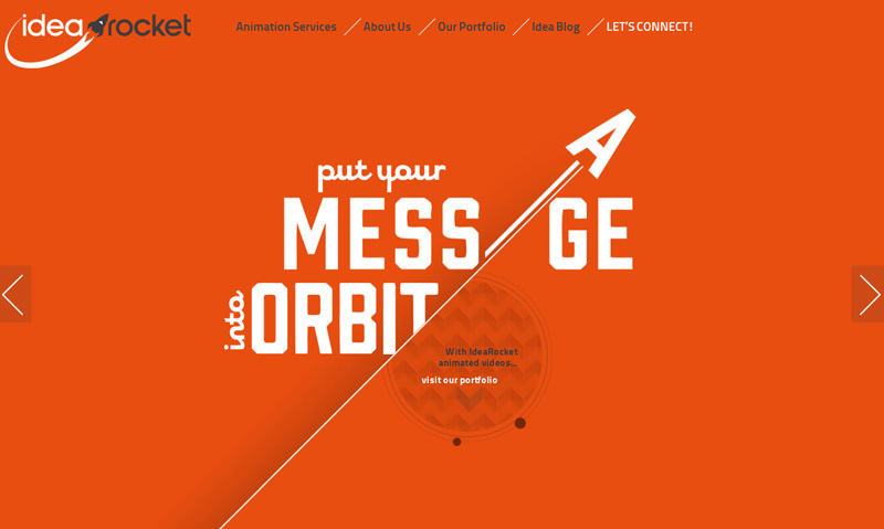
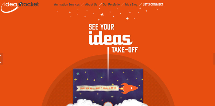
From the get go we knew that responsive web design for this website was a must! Starting with the Home page we had concerns with the navigation of the website right away. The navigation is a critical area of any website and it was barely noticeable. The font used was extremely small and the navigation placement was almost completely out of sight. Probably the worst thing you can do with the navigation is make it difficult to find. Some of the main navigation pages were not even clickable, causing user confusion. In addition there were too many subcategories, which were not only unnecessary but not properly aligned making the overall navigation ineffective. We decided early on that keeping the color orange was one great way to produce a vibrant color palette for the new website we had in mind. We also knew we wanted to incorporate movement and give visitors a little flavor of the animation services offered. The new homepage would be highly engaging with movement and stronger calls to action. The overall minimalist style we incorporated also helps keep more of a visitor’s attention on the company’s custom video. See the difference below:

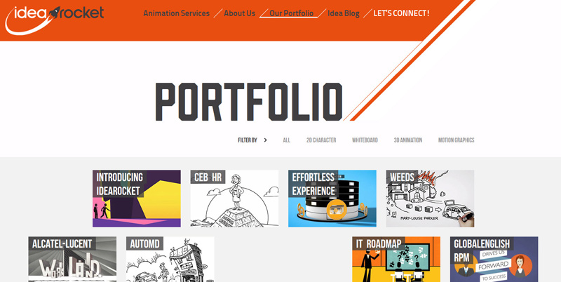
The Portfolio page received an extreme makeover as we wanted the custom videos to be prominent and move into place as the user scrolled down. HTML5 & CSS3 was used to create movement and better display creativity and craftsmanship. Whereas the old page lacked energy and missed an opportunity to showcase great work; the new page is well organized and provides a smooth user experience.

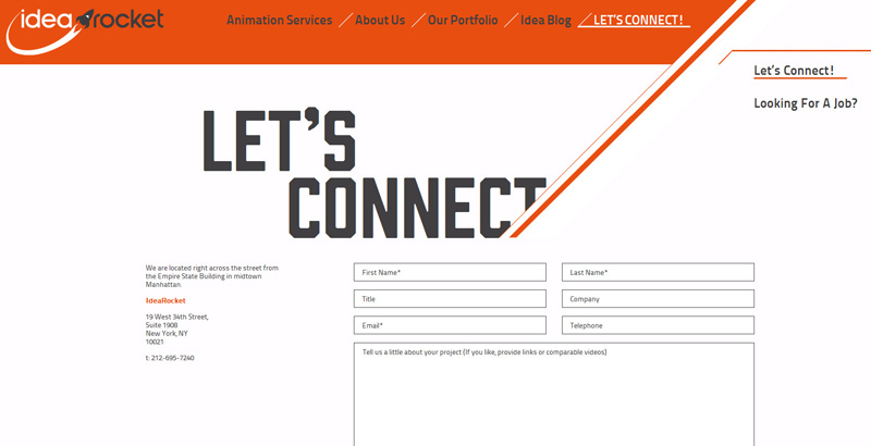
The old web design for the contact page was likely the weakest link in the puzzle and was failing to convert visitors into inquiries. The map used was boring and the page was uninviting. The contact form was also too long and the font was small. We re-designed everything from scratch and made certain the new contact form was was inviting and the contact form easy to read with only the necessary data fields. When conversion is critical you want to make certain your contact form is a breeze to complete and submit. These days nobody wants to spend 4 minutes filling out a contact form. Stay concise and make sure the contact form is quick and easy to complete (under 60 seconds is ideal). Often times contact forms fail as they bog the user down by attempting to collect too much information with various questions. Avoid losing potential customers from frustration. The new web design for the contact page and contact form provide a streamlined user experience which will lead to an increase in conversion.

The final product delivered was work we are quite proud of. IdeaRocket is thrilled with the new look and functionality of the new business website. Now the website immediately grabs visitor’s attention while carefully guiding them through the most important areas including the online portfolio and contact form. This client is a long term partner and we’ll check back with them throughout the next several months to see just how much the handcrafted website has improved results!
