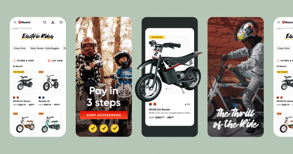
The simplest truths often carry the most weight. Even when it comes to e-commerce. As competitive and dynamic as e-commerce is now, the simple truth is that it’s still all about the customer.
So while companies can set themselves apart with distinctive branding and unique products, they miss out if they lack strong UX and performance, or fail to lead with elements that drive conversions and follow-up. Ecommerce user experiences that drive purchases are built around all of these working together.
UX Design for Impact
E-commerce user experiences that focus on purchases should begin by standing out to prospective customers. Because it is easier than ever for new brands to enter the market, it is paramount for brands to impress users in ways both surprising and subtle.
That means outstanding website performance and strong UX are non-negotiable. These elements aren’t exclusive to e-commerce, but market competition has exploded with the advent of Shopify, so what might have seemed secondary before should now be at the forefront of your approach. If you make people wait for what they want, they will leave and go to someone faster.
Memorable branding and positioning are similarly significant. The power of branding lies in giving people something they want to see in their world. An example of a business doing this well is Seed.com, a microbial probiotics company. The Seed.com brand is clearly defined and consistent, with apparent science-oriented positioning, and the overall user experience is clean and continuous from start to finish. It’s designed in a way that feels both personalized and exclusive—all of which drive users toward conversion.

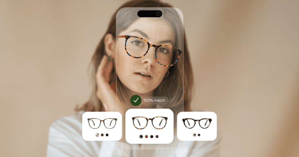
Immersive features that digitize familiar processes also pack a punch by creating a personalized and accommodating experience. Warby Parker and Framebridge are two examples of companies that use these features intelligently. Warby Parker offers an AR eyeglasses frame try-on through their app; Framebridge has its own virtual framing walkthrough and preview tool, as well as relative sizing visuals and accompanying placeholder content for different mediums and objects. Elements like these create a unique interaction that helps the user connect with the product easily. And they position companies as convenient and reliable, which ultimately helps build a stronger connection with customers.
Finally, don’t forget the value of strong analytics and comprehensive tracking at every step of the sales process. Following up on potential customers is the best way to get them to come back, especially if they already have that initial interest in what your business offers.
Best Practices for eCommerce User Experience
What works for one brand or product may not work for another when it comes to e-commerce. So the idea of “e-commerce best practices” is fairly subjective. That said, there are a few choices companies can make that tend to have powerful results.
- Great photography and visuals. Given the nature of e-commerce, visuals’ importance can’t be overstated. Prospective customers want to see what they are purchasing and understand how it fits into their lives. Brands can make this component even more resonant through AR tools that let users try a product or experience before purchasing. Ultimately, making excellent visuals part of the e-commerce equation involves users in a way that makes them feel understood.
- Interactive functionality. When users have the chance to experience the unique and differentiating parts of a product, it makes them feel more included and aware. The AR tools noted above are part of this—they are a huge and relatively inexpensive opportunity to streamline the funnel and build connections.
- Effective storytelling. This implies storytelling that puts the product in front of the user just when they need it. There are several ways to accomplish this; one powerful way is through a guided walkthrough that contextualizes and personalizes the product. Content marketing that meets the right audience at the right time is another because it’s about finding a fit without making the story entirely about sales. Rather, it’s about how the product works for prospective customers and fits into their lives.
What do all of these practices have in common? They prioritize the user. They’re all about highlighting what’s most important for prospective customers to know, drawing attention to where it matters most, and putting that attention to valuable use in order to create conversions.
Capture—and Keep—Your Customers’ Attention
We know that capturing attention is key. So what kinds of eCommerce user experiences successfully do this, and retain it over time? Personalized experiences are one great route. Sephora is a brand that does this well. The beauty brand captures a customer profile based on specific characteristics and preferences and uses that information to filter product recommendations. Consumers are presented with products that are most relevant to them, which creates a feeling of exclusivity, and that the brand knows what they want. We want to choose an individualized, streamlined user experience.

Speaking to customers’ values is another effective approach. For example, brands can make an impact by fostering donations to causes relevant to their audiences. We want technology that gives customers a sense of autonomy and participation in the market. Customers have a visible indicator of the influence their purchases can have, and affirmation that the brand resonates with their values. One brand that does this notably is The RealReal. Their user profiles keep a cumulative tally of how much water customers have potentially saved by shopping second-hand with them.
Of course, there are many ways to lose consumers’ attention, too. Keep in mind people’s distractibility, and the fierce competition for their attention, and avoid long, overwrought storytelling. A lack of in-situ photography—or even poor photography—can present the same problem, and hinders the conversion process by failing to demonstrate scale. That makes finding details on dimensions—and other information—overly complicated.
There’s also a common tendency in e-commerce to overwhelm users with options rather than present them with ideas. Instead, remember the power of suggestion. Give users a place to start in order to build a better, more lasting connection, and to keep their attention long enough to make a purchase.
Building a Connection
If you’re wondering how to address any of these areas without falling into tired trends, start by talking to your customers. Find out what would meet them where they are, rather than alienate them. You’ll be better off for it. Ecommerce user experiences are built with user-first decisions. Creating a memorable experience begins there. It’s in the details where your company will build connections that last, and that invite customers to remember your brand—and come back to it again and again.
