Tilton School is a private boarding school that connects students with a curiosity-driven education. A brand that challenges students, ignites their passions, and gives them a lifelong love of learning. Our team created a vibrant digital viewbook that amplifies this mission, and to reach prospective parents and students in their journeys to find the right boarding school. The viewbook showcases Tilton’s community and curriculum, offers the chance to learn more in one visit than would be possible through a print media campaign, and streamlines marketing and communications. It provides robust data tracking to clarify the conversion points and inform content development.
 News Corp is home to some of the world’s most trusted brands, including Dow Jones, Harper Collins, and the New York Post. Isadora Agency’s expertise as a web development company allowed our team to build News Corp an internal benefits website that changed their employees’ views on benefits in a creative, refreshing way.
  Isadora Agency, a custom web design agency partnered with TravelStore, one of the top-rated travel management companies in America, to create a seamless website experience for travel connoisseurs. TravelStore crafts unique itineraries for vacationers looking to travel in style and personalizes superior corporate travel programs for a sophisticated clientele.
 Tilton School

OVERVIEW
Services
Art Direction, Communication Strategy, Content Strategy, Marketing Collateral, User Journey, Web Design, Web Development
COMMUNICATION PLAN & STRATEGY
A new communication plan and strategy will further help Tilton increase overall admissions applications, and increase prospective student and parent engagement and inquiries.
While the plan focuses on web interactions, its effect should ripple out through other channels. Our team will track this tool’s success by these KPIs:
- Increase in phone and email inquiries
- Increase in overall web interactions during the admissions process
- Increase in email communication conversions
Within a few months of the first release, Tilton saw an increase in contact page visits by rates of 59% compared to the previous year. Tilton also experienced an immediate boost in SEO due to the on-page SEO-influenced content strategy, ranking 9th on Google in searches for “boarding school viewbook,” a strong start to an ongoing SEO strategy.


STRATEGY
While Tilton School has unique opportunities for students, it was clear that the communication approach had gaps. Staff-to-student relationships were not a focus. The admissions process did not offer insight into campus life for international families, and there was a lack of clear next steps to guide users through admissions. Our content strategists addressed these gaps with a personalized experience that would increase applications and offer a smoother conversion journey.
The Tilton digital viewbook invites users into the Tilton community, highlighting its incredible people, places, and experiences, and prompting prospective students to join something bigger than themselves. Tilton’s longstanding message, “The people make the place,” was the foundation for emphasizing this community-centric nature.
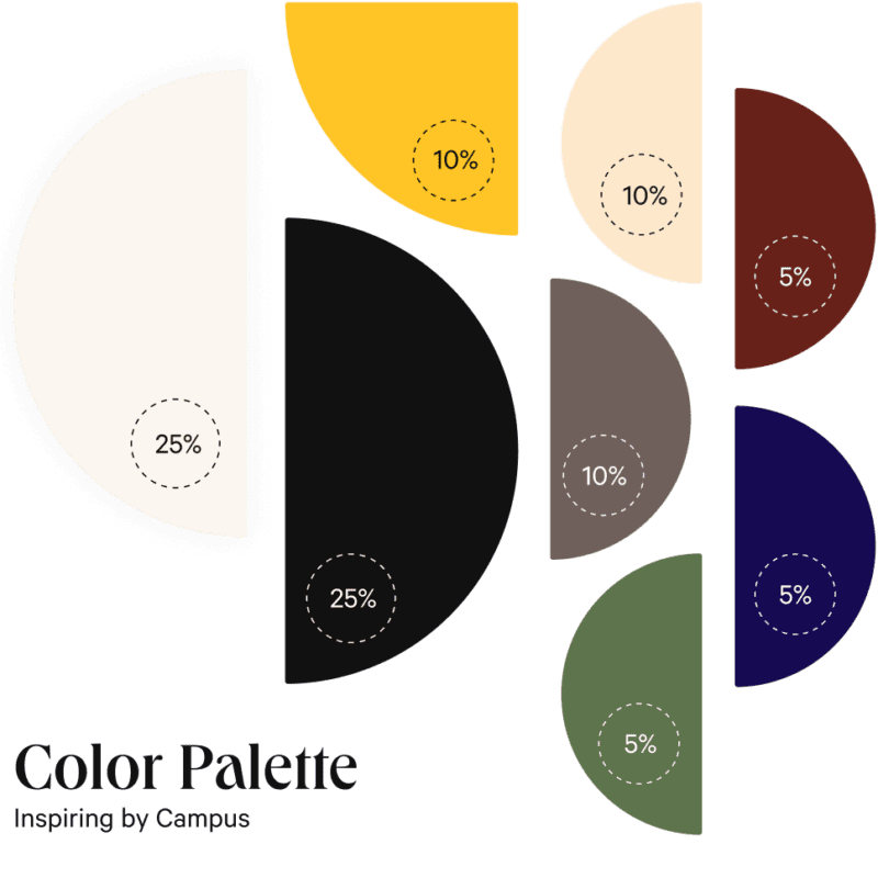
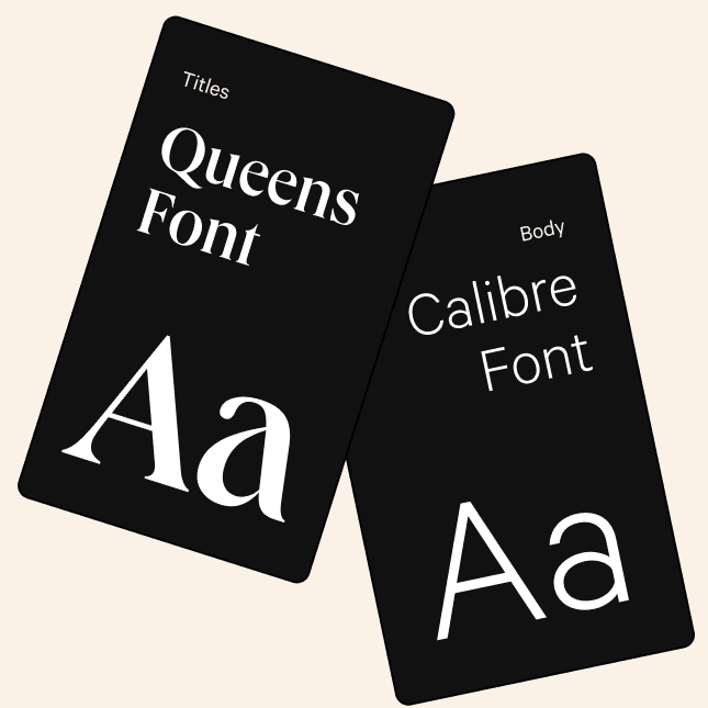
The project led to refreshing Tilton’s brand. Refining the brand’s voice, tone, and persona helps Tilton stand out against competitors, and accurately reflects what the school offers. Refreshed print materials—with updated, brand-specific typography and images—further express the brand while capturing student and parent attention and boosting applications and enrollment.
PERSONAS
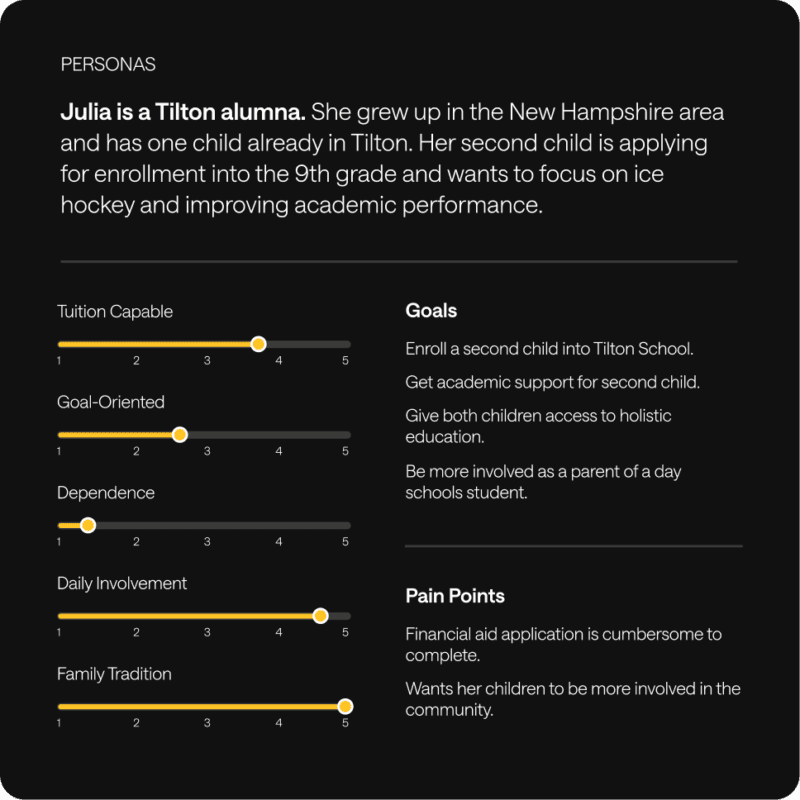
Tilton Parents are the primary enrollment decision-makers and key audience. To better understand the different parent audiences, as well as the Tilton prospective student audience—13- to 18-year-olds seeking a more well-rounded education—our team applied user personas to the strategy.
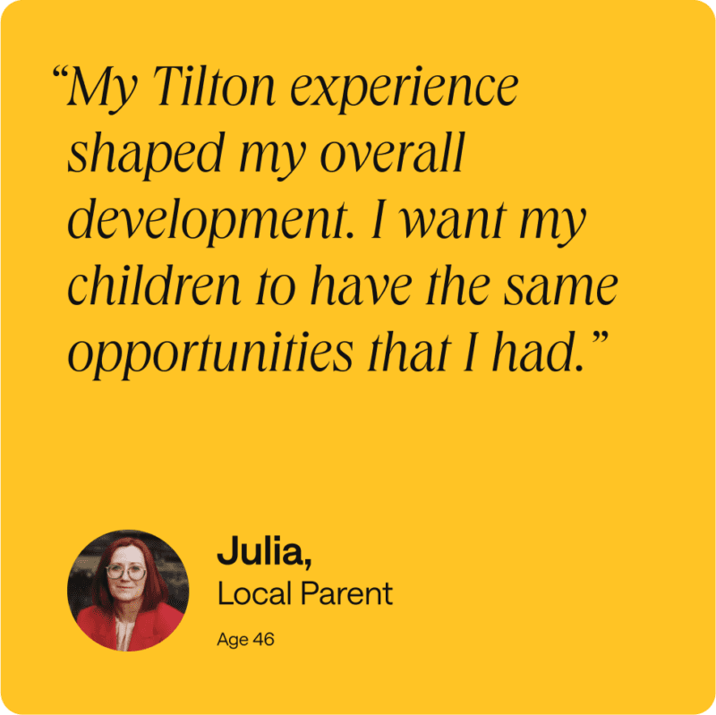
The key findings showed that all parent groups’ primary motivation was an individualized learning environment that ensured strong academic support for students. In addition, international parents sought a safe, small town location as well as a foundation to enter prestigious US-based universities; US-based nonlocal parents prioritized a location optimal for outdoor activities; and local parents wanted to pass on their own Tilton experiences. That meant a focus on the location and physical environment was significant, and went hand-in-hand with highlighting Tilton School’s powerful academic opportunities.
BRAND REFRESH
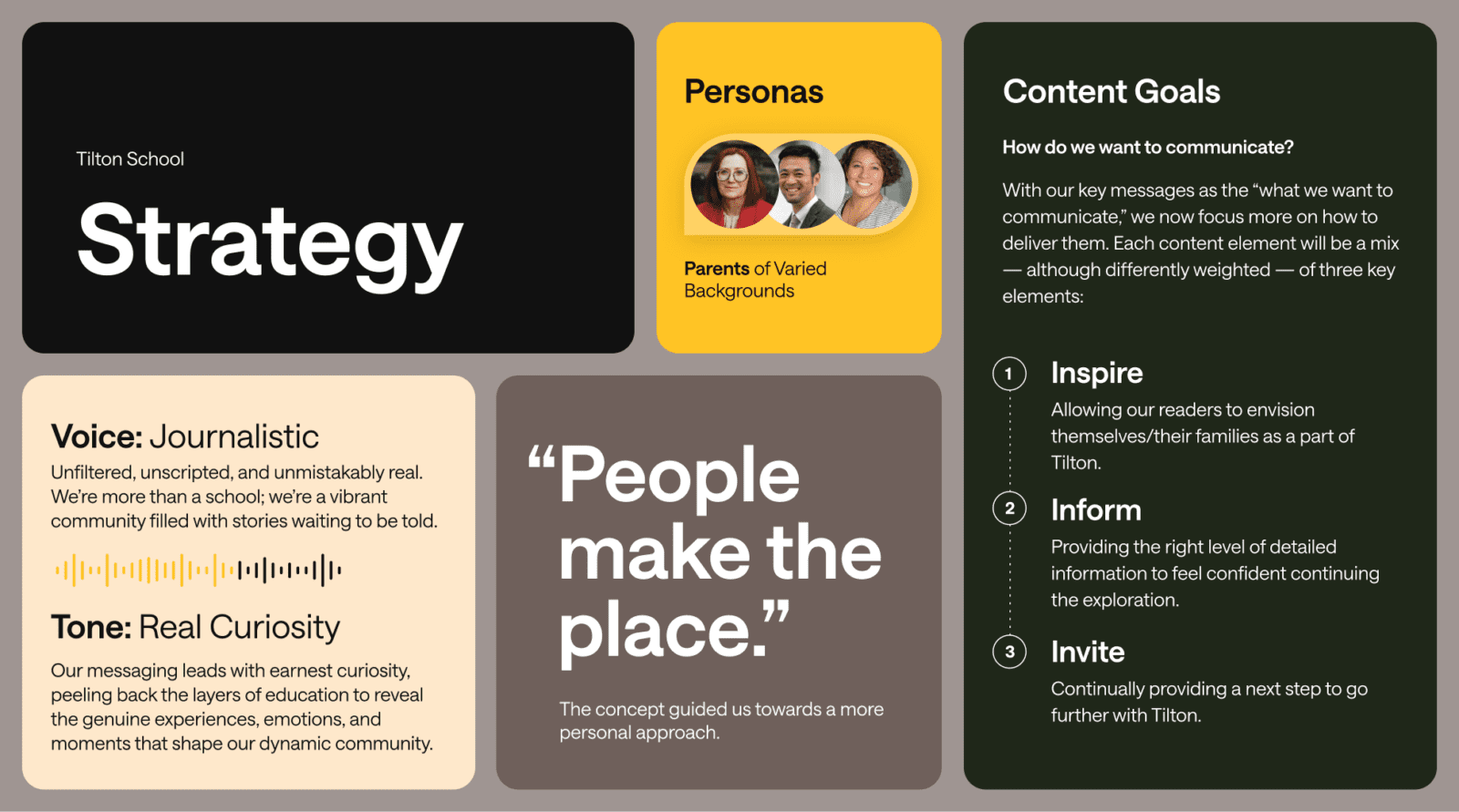
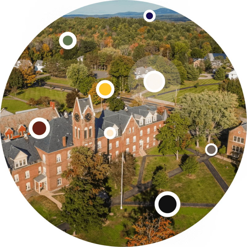
A brand refresh was the digital viewbook’s framework. Updating the brand’s persona, voice, and tone was important for standing out against competitors. A mood board emphasizing adventurousness, confidence, and warmth set the tone for this step, and highlights Tilton’s focus on relationships and exploration.
Our team defined a journalistic voice, a curious tone, and a series of new key messages to emphasize Tilton’s mission. These messages speak to Tilton’s values of community, hands-on learning, experimentation, and student growth.
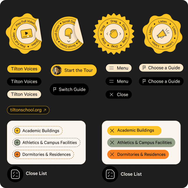
DIGITAL VIEWBOOK DESIGN
This eye-catching, immersive digital viewbook complements Tilton’s more informational main website, and captures user attention through campus stories. It inspires students and parents to explore the school environment, and increases Tilton’s overall reach. It’s a powerfully multifaceted solution: flexible, scalable, shareable, and inspiring.
The homepage highlights Tilton’s main focus areas: the Mastery Approach, About Tilton, and Student Tour. Featuring both these evergreen categories and more topical content such as articles and videos offers a sense of Tilton’s ongoing activities and foundational offerings, an approach that builds user trust.
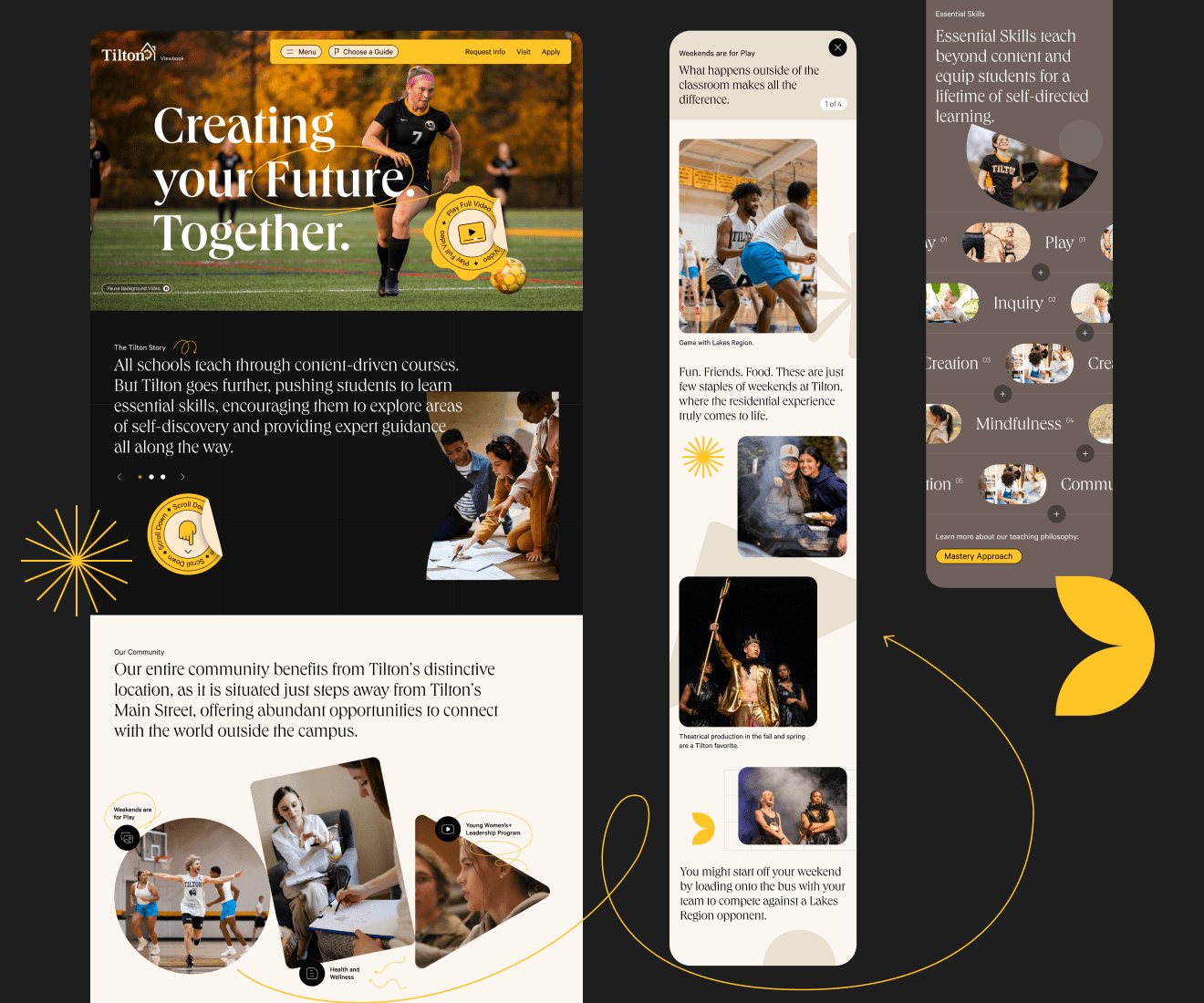
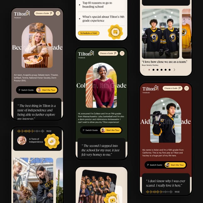
An extraordinary mobile experience was vital for reaching both the student and parent audiences. Our goal was to create a memorable mobile site that exudes the same feeling and experience as the desktop version, while keeping parents and students engaged and making it simple to visit, apply, or learn more.
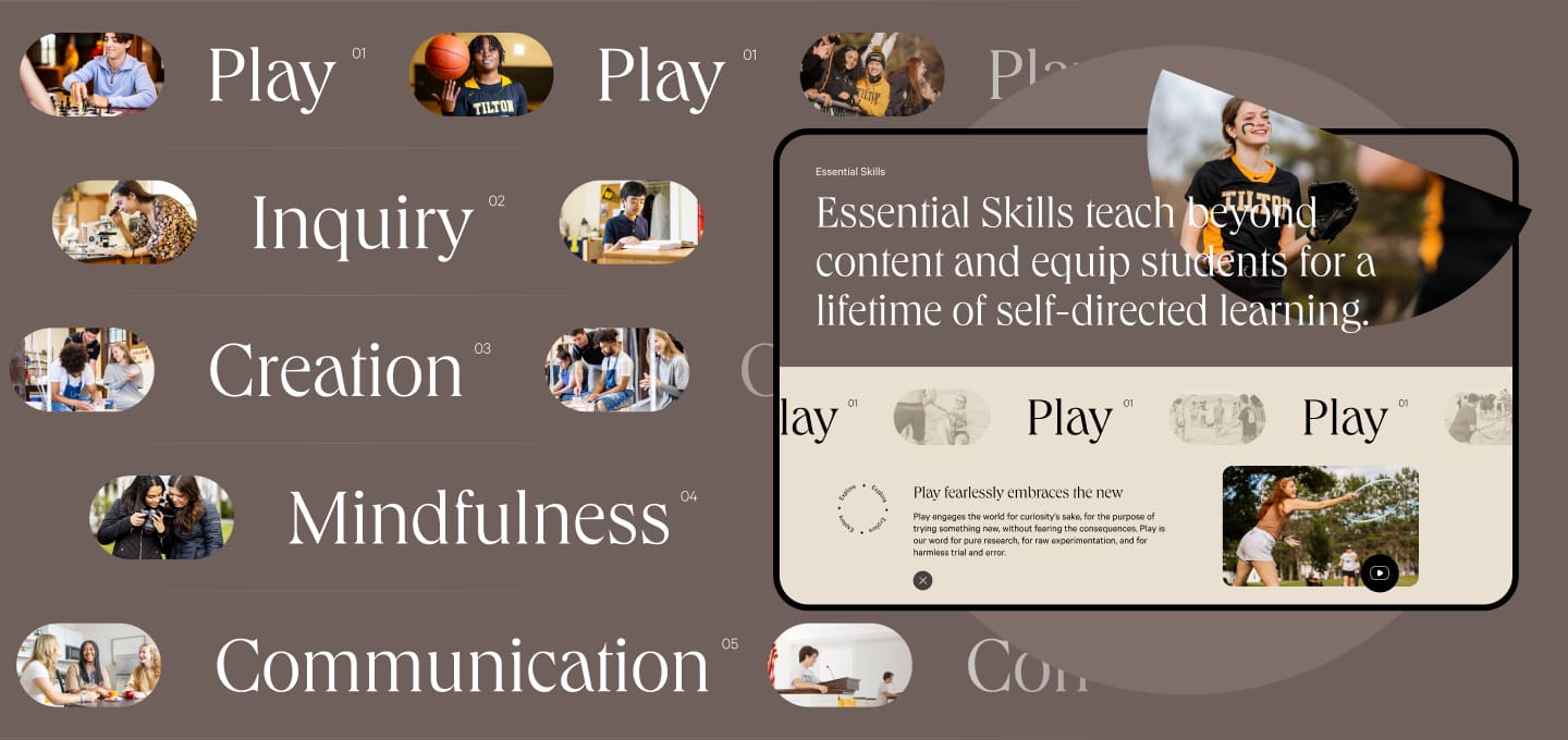
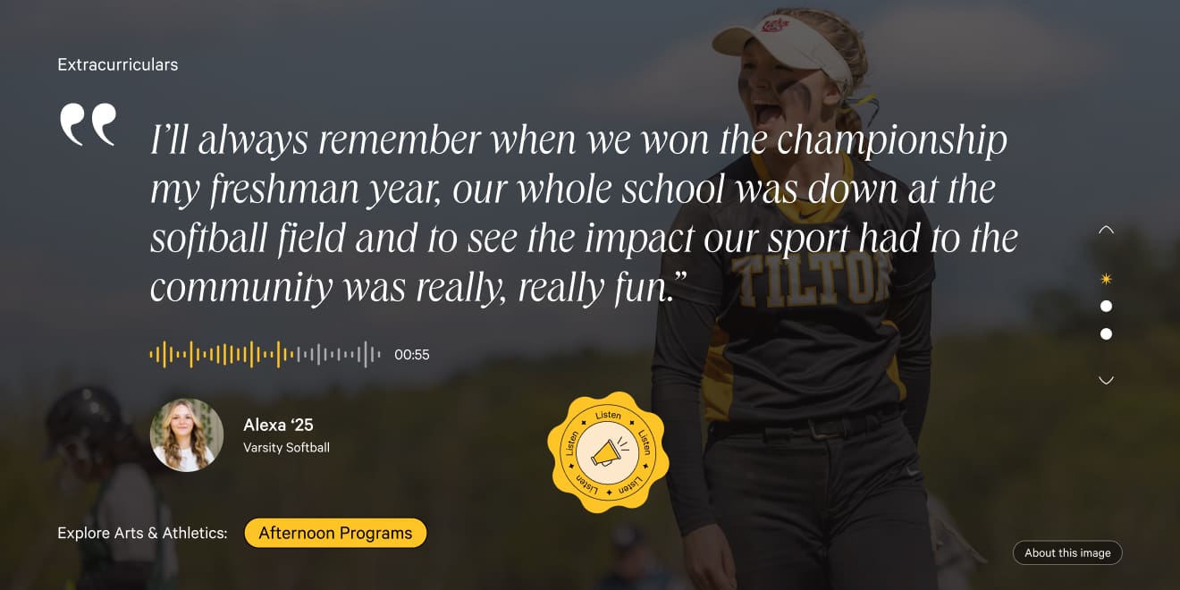

STUDENT TOUR DESIGN
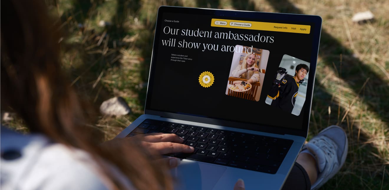
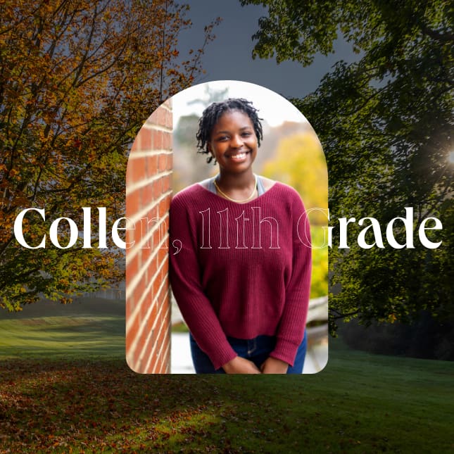
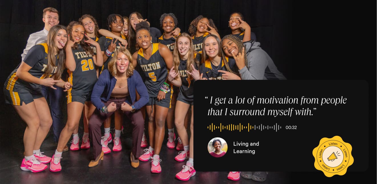
The student-led tour is inspired by Tilton’s on-campus Ambassadors—students who promote the school to prospective families. It gives users a personal connection to the student body and is as close to a student’s first-hand experience as they can get before personally touring campus.
EXPLORE CAMPUS DESIGN
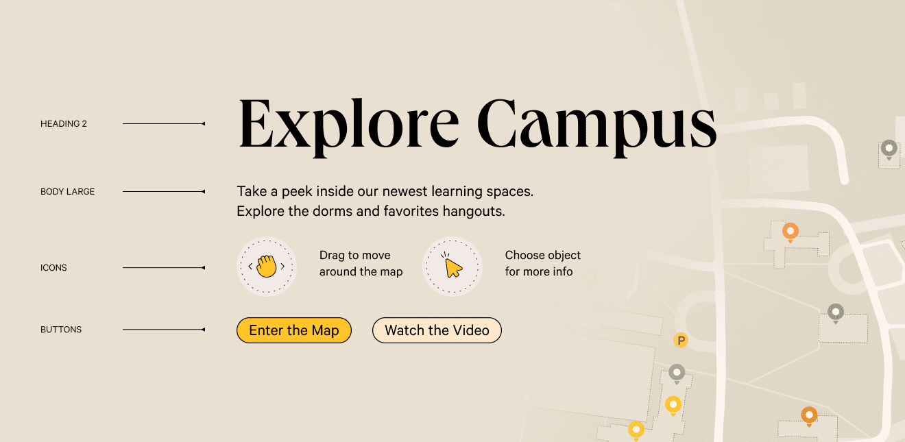
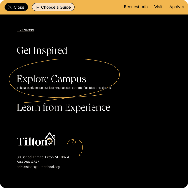
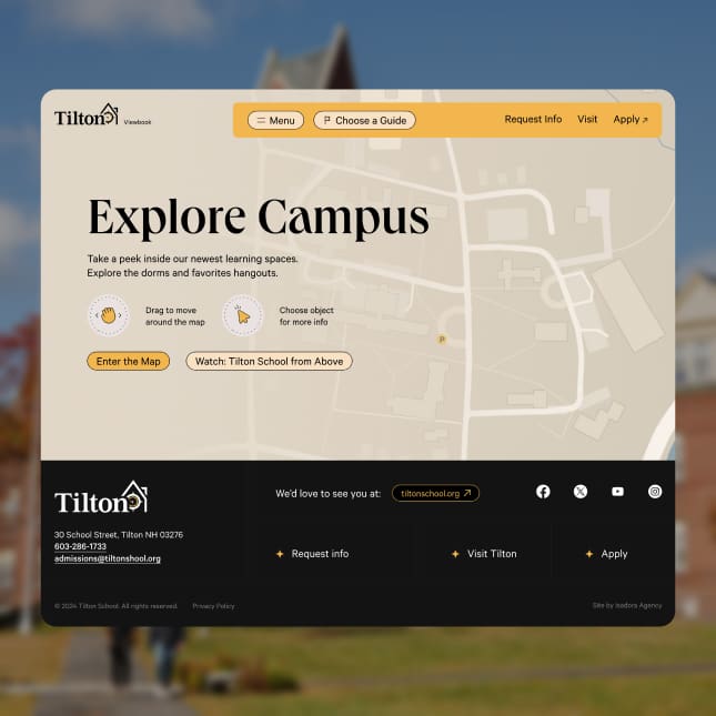
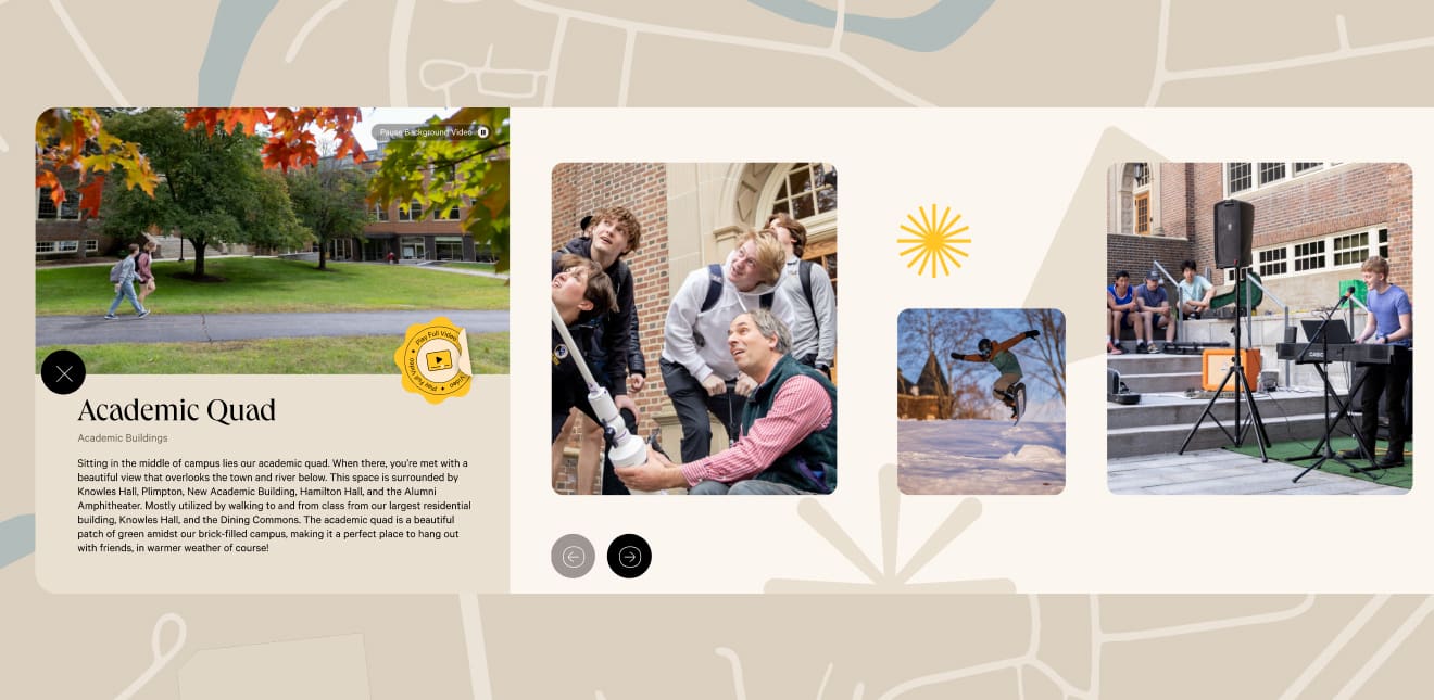
The Explore page features a Tilton School campus map that uses authentic videos and imagery, creating the feeling of actually being there. This connects users with the school environment and inspires them to contact Tilton for an in-person tour.
PRINT MARKETING
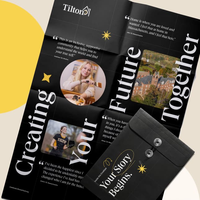
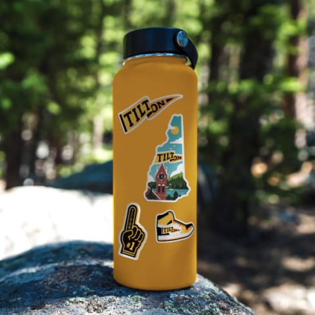
The digital viewbook’s visual elements are authentic to Tilton’s mission and values, which highlights the brand’s adventurous personality and distinguishes the school against competitors. Isadora Agency applied its design strategy to additional marketing materials—a poster, postcards, and stickers—that advance admissions communications. These materials guide users to the digital viewbook, encouraging them to log on and learn more.
CONCLUSION
This work exudes an authenticity central to Tilton School’s brand, and will powerfully connect with prospective students and parents while encouraging them to invest in a community that’s made for them. Tilton School will see the benefit of that investment over time.
Isadora Agency’s partnership with Tilton School includes ongoing services. Our team will continue providing a comprehensive, visibility-boosting SEO and SEM strategy. This approach will pointedly and effectively reach Tilton School’s target audiences, and produce data-driven digital marketing results.
