Customer Journey, UX / UI, Web Design, Interactive Prototypes, Web Product, Web Development, User Experience Design
 News Corp is home to some of the world’s most trusted brands, including Dow Jones, Harper Collins, and the New York Post. Isadora Agency’s expertise as a web development company allowed our team to build News Corp an internal benefits website that changed their employees’ views on benefits in a creative, refreshing way.
  Isadora Agency, a custom web design agency partnered with TravelStore, one of the top-rated travel management companies in America, to create a seamless website experience for travel connoisseurs. TravelStore crafts unique itineraries for vacationers looking to travel in style and personalizes superior corporate travel programs for a sophisticated clientele.
 Hilco Global
Project overview
Hilco Global is a diversified financial services company with over 35 years of experience working with the world’s leading banks, professional advisors, law firms, and other institutions. Isadora Agency’s work with Hilco was in-depth and extensive. The company initially sought a corporate website redesign. However, after a deep brand audit, it became clear that Hilco needed a more comprehensive digital brand transformation. Isadora Agency’s work redefined the brand’s services, values, positioning and customer interactions across all 25 of their operating companies. This aligned Hilco more closely with the evolving needs its target audience. We turned a fragmented website into a cohesive, powerhouse digital tool. This amplified user trust, and transformed user perception of Hilco’s website. The new experience is now a “house of solutions” for the brand’s diverse audiences.
This transformation involved consolidating 25 disparate websites and thousands of pages into one unified hub. We eliminated silos, created a streamlined user experience, and accentuated the company’s breadth of services. Our work gave Hilco a more authoritative presence by organizing vast amounts of content and designing a more sophisticated, formal, and modular design. As a result, the new website speaks to Hilco’s credibility. Users may now access a variety of solutions and services from a single source, eliminating the need to visit multiple sites. The new structure provides synergies between services they might not have otherwise considered, creating even greater potential for new business.
Amplifying Hilco’s accessibility and findability extended to SEO—a vital step, as users typically find Hilco via organic search. Isadora Agency’s SEO and analytics team performed a competitive SEO audit and analytics review before creating a detailed redirection strategy and applying SEO best practices to the Hilco website. The redirection in particular was a massive undertaking that involved all 5,000+ pages, and was crucial to preserving Hilco’s existing search engine rankings while creating a smooth user experience.
PERSONAS
Creating four distinct customer personas for Hilco helped their team understand their audiences’ differing needs. By mapping out the goals, motivators, pain points, and needs of each of these four personas, we made Hilco confident that their site would be able to meet any scenario. This differentiation illustrated how, for example, a higher-level executive seeking to contact someone quickly has different needs than a broker researching liquidation services for a client. Detailed user journeys for each persona strengthened Hilco’s understanding of the flow of these scenarios. The streamlined journeys effortlessly guide prospects and customers further down the sales funnel.
STRATEGY
Our team tackled this challenging project by:
- Defining customer personas to better understand the audience’s needs and user flow.
- Completing an exhaustive content audit of all subsites.
- Creating a comprehensive sitemap that allowed for growth.
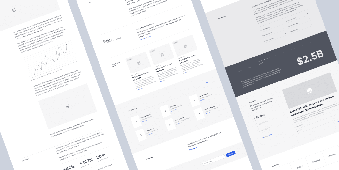
- Building wireframes that provided a logical structure for easily navigating the website.
It was a pleasure working with the Hilco Global team to transform their website into a platform that exemplifies their company values while elevating their brand.
HOMEPAGE
Hilco’s homepage receives the website’s highest traffic, so recreating it was an important focus. Placing the most crucial information front-and-center helped accomplish this, so Hilco’s four solution areas, clients, case studies, and key statistics were visible and prominent. It’s a bold reflection of Hilco’s credibility, and a clear means of drawing users directly toward information they need while keeping them on-page. Featuring a hero video that highlights Hilco’s Chicago headquarters served to give the homepage a sense of place and personality.


Operating Company Pages
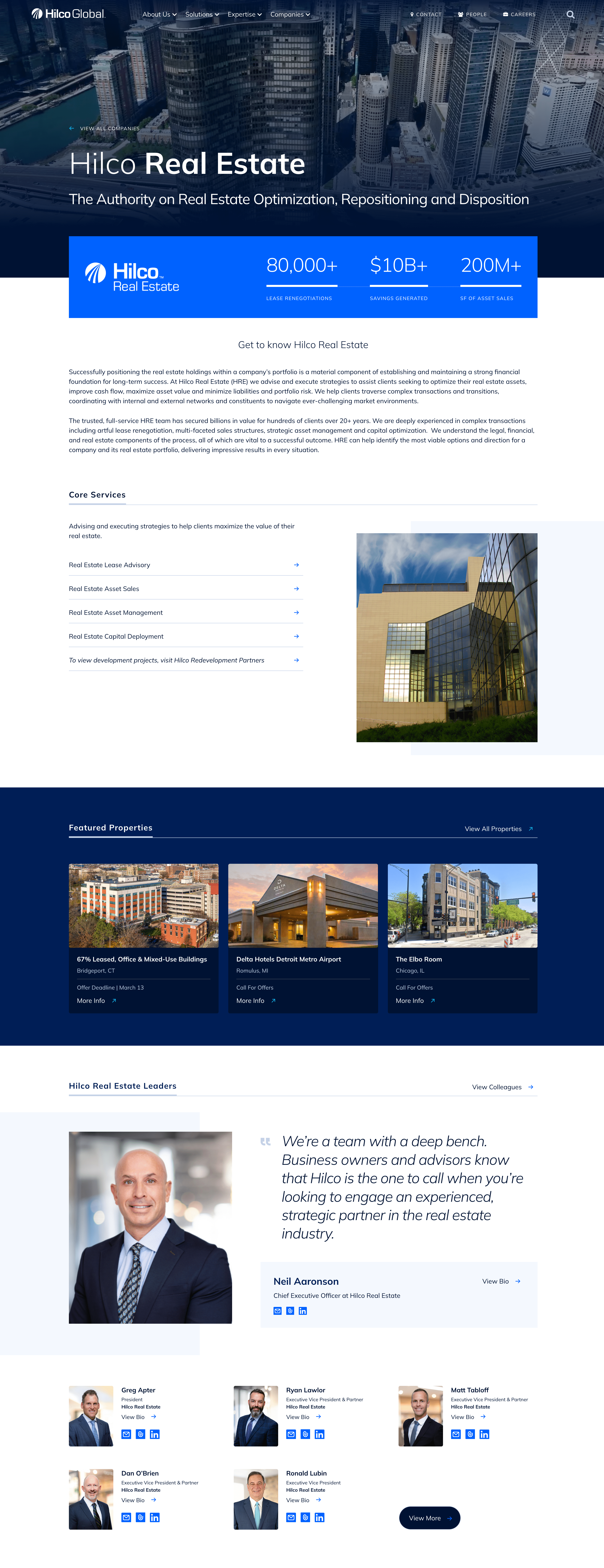
Hilco’s portfolio includes over 22 different trading companies. New business arrives via user search for the majority of these subsidiaries. Executives have specific goals in terms of specialty financial services, so it was essential that each company had its own homepage. We assessed the structure and information architecture of all the websites, page by page. This allowed the creation of unique landing pages that better featured these specialty services. Users now have a much clearer picture of options, and how to address financial needs. New pages serve as both standalone profiles, and entry points that drive traffic to Hilco’s main hub.

Company Directory
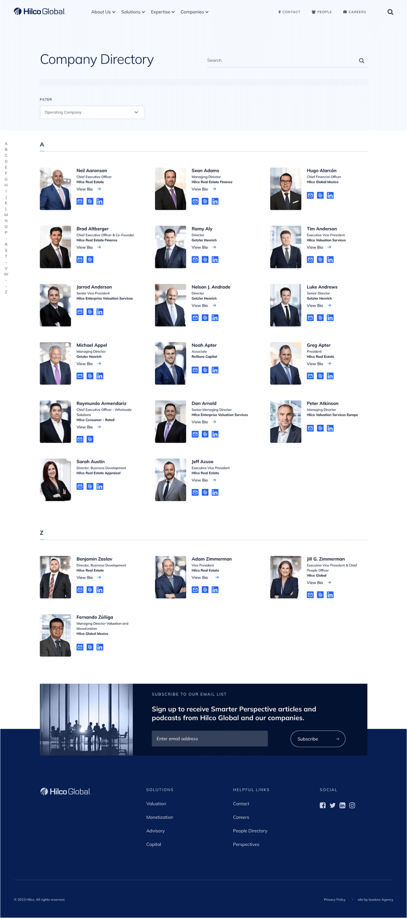
Since the website is a main source of contact information for users, Hilco needed a way to easily contact the correct representative. The solution was to create a company directory. This sleek tool gives users just the details they need—without overwhelming them—and offers a well-organized platform to more fully engage with Hilco’s services.

NAVIGATION
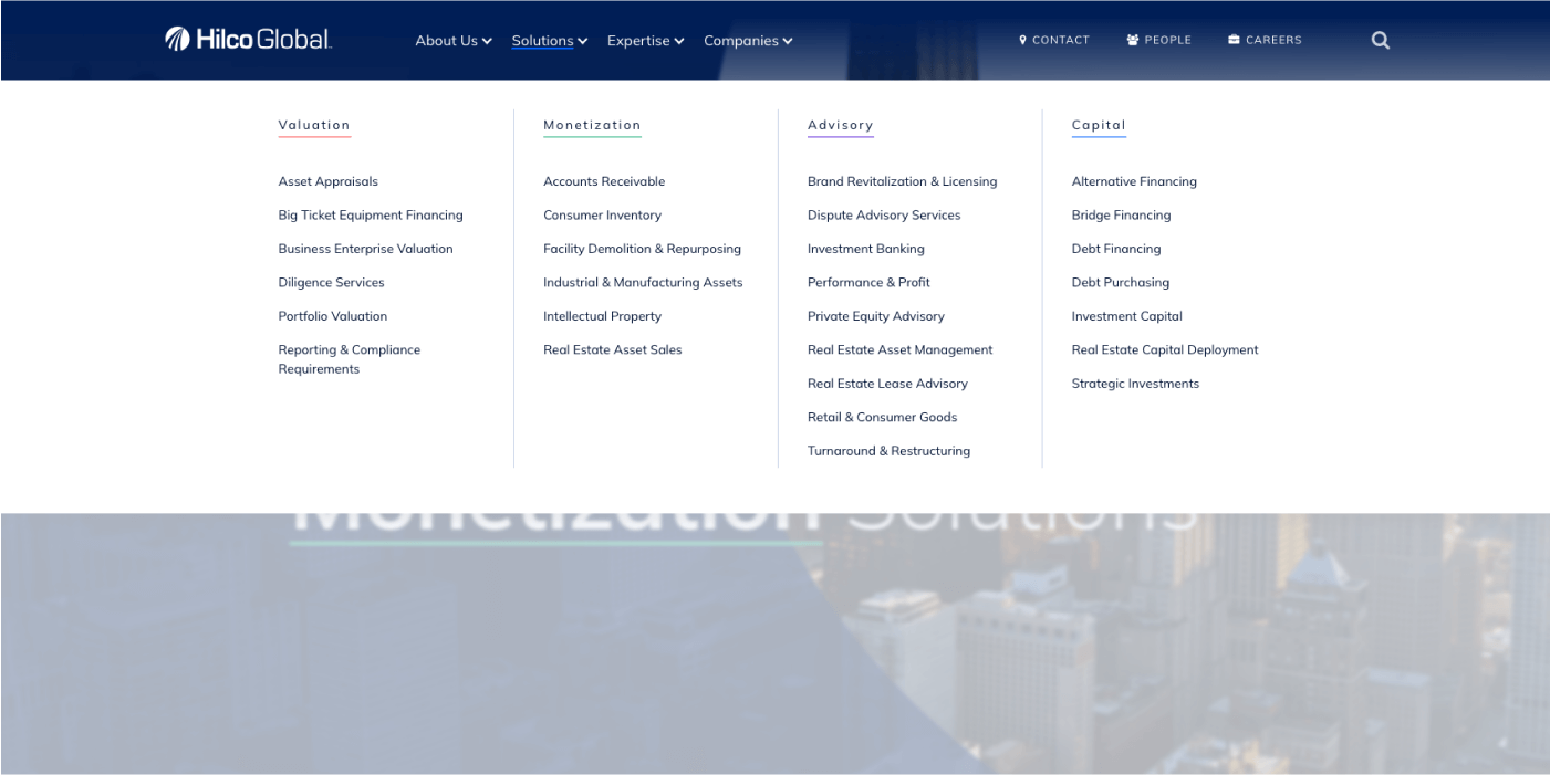
Simplifying Hilco’s website navigation was a major part of addressing the company’s vast array of services and ultimately redefining its online presence. It meant auditing the kinds of strategic insights Hilco offers, and breaking them into four unique categories of solutions: capital, advisory, monetization, and valuation. It was important to make sure each of these could be featured without inundating users with information and above all keeping them engaged with the right content. We organized the complex display of operating companies, solutions, and services into a mega menu, making it easier for visitors to find the information they need.
MOBILE LAYOUT
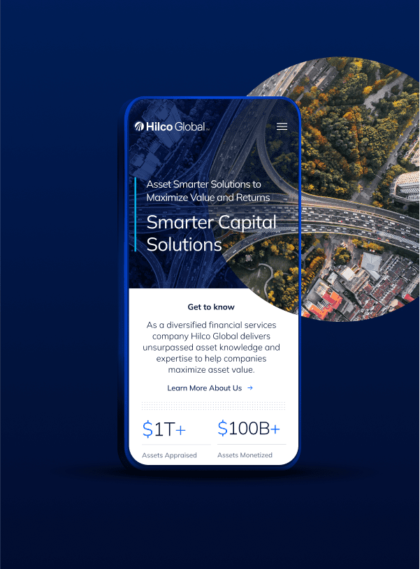
This digital transformation included a responsive mobile version of the site that caters to users on the go. It presents all the information found on the desktop site in small, digestible chunks for easily distracted viewers. The new website is fully responsive, and as a result automatically adjusts the layout, font, and image sizes to all resolutions. This feature provides audiences with a visually appealing experience across all devices.
