Services
Discovery / Concept / UX/UI / Mobile app UI Design, Mobile First Design / Web Design, Web Development, CMS Integration / Lead Generation Web Product / Iconography
 News Corp is home to some of the world’s most trusted brands, including Dow Jones, Harper Collins, and the New York Post. Isadora Agency’s expertise as a web development company allowed our team to build News Corp an internal benefits website that changed their employees’ views on benefits in a creative, refreshing way.
  Isadora Agency, a custom web design agency partnered with TravelStore, one of the top-rated travel management companies in America, to create a seamless website experience for travel connoisseurs. TravelStore crafts unique itineraries for vacationers looking to travel in style and personalizes superior corporate travel programs for a sophisticated clientele.
 Most importantly, the fintech brand reduces the stress involved at the register! Firstly, by providing fast, fair, and transparent installment financing solutions to people across the credit spectrum. In short, the executive team approached Isadora Agency with an RFP that included a diverse range of new requests. For instance, a customer portal design, mobile app UI design, and development of a quality lead generating marketing website, all from scratch. Meanwhile, during our detailed discovery, separate design teams worked on the customer portal and mobile app UI simultaneously. However, the mobile-first design was also a priority as both customers and dealers would mostly access it via mobile phone or tablet. Therefore, B2B dealers were the primary target audience, while their budget-conscious customers served as the secondary target audience.
Discovery / Concept / UX/UI / Mobile app UI Design, Mobile First Design / Web Design, Web Development, CMS Integration / Lead Generation Web Product / Iconography
In addition, we created user flows and customer journeys to ensure we understood every touch point a customer could make. As a result, powerful and new key features in the customer portal were the dashboard design with clear menu options. In addition, we eliminated various messy sections and designed a clean, organized, and minimalist experience. Meanwhile, showcasing only the pertinent information a customer wants to know. For instance, important information such as historical data, credit card purchases, and remaining credit availability is easily accessible for quick customer comprehension.
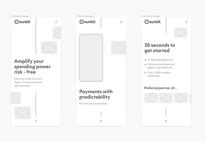
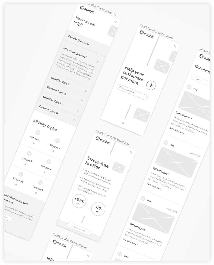
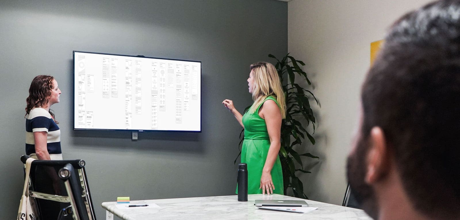
Certainly, with all our enterprise web products, every detail was considered and designed from scratch. For example, the design details, the bold color palette with blue and gold accents, and the new iconography set efficiently represent services provided and Sunbit’s various industries.
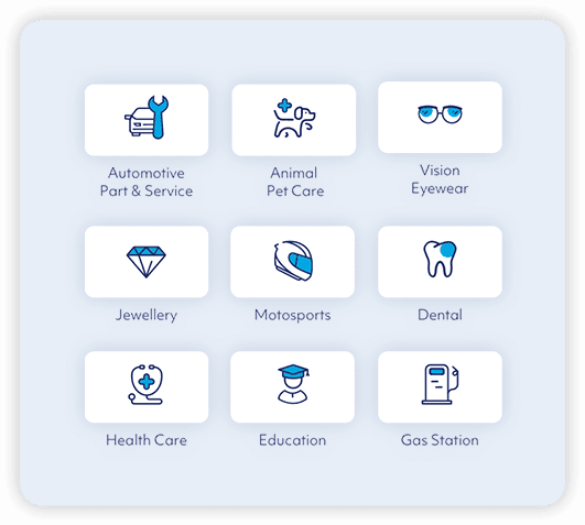
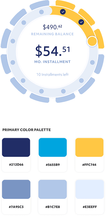
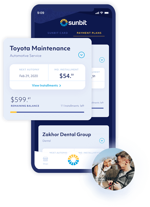
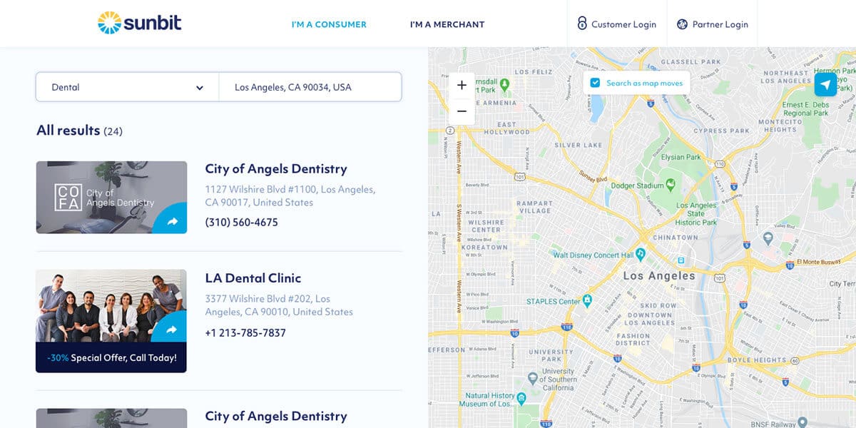
Efficiency was the overarching mobile strategy our team executed for the registration, login, and account dashboard areas. The select mobile mockups are just a handful of the numerous new screens our team designed in order to create an effortless and enjoyable customer experience. All UI elements were conceived and organized to highlight Sunbit’s superior modern technology and financial efficiency.
In order to drive high-quality lead generation and conversion, we developed a fun and animated experience. It really helped bring the web product to life! As a user scrolls down, intelligently placed CTA’s drive you to precise microforms that get sent automatically to the correct sales rep via easy submissions.

Highlighting the reach of retail partners around the country, bite-sized statistics and testimonials deepen user interest. Therefore, potential B2B partners are encouraged to learn more.
