The Hybrid and Zero-Emission Truck and Bus Voucher Incentive Project (HVIP) is an important California initiative. Isadora Agency partnered with HVIP for a comprehensive digital transformation. The scope included a website redesign and new content strategy, to boost user engagement and effectively deliver critical program information.

Tilton School

An empowering, exploratory learning environment brought to life online. Isadora Agency partnered with New Hampshire-based Tilton School to build the student community with a fresh, dynamic digital viewbook.

Popcornopolis

Ecommerce website design for Popcornopolis brings high-quality, nostalgic flavors of popcorn to modern families on the go. A fast-growing leader in the CPG space, Popcornopolis needed its eCommerce website to keep up with increasing demand from devoted fans for tasty gourmet snacks, gift sets, and holiday assortments.

Brookfield Residential

Homebuilder Brookfield Residential teamed up with Isadora Agency for extensive UX and digital product design to boost engagement and lead generation. New features and tools were created to showcase Brookfield’s stunning communities more effectively. As a result, user interactions grew significantly, generating thousands of contact form submissions.

NCCER

Isadora Agency recently worked with the National Center for Construction Education and Research (NCCER). An educational nonprofit dedicated to craft professionals’ career development; NCCER needed to transform their brand. We achieved that goal by creating a powerful website design and visual identity to match.

Upli

Could employers dramatically enhance employee financial wellness through a feature-rich mobile app design?  Discover how our agency's comprehensive design solved this Fintech challenge through highly interactive tools and a sticky experience essential for frequent user engagement.

Kelley Blue Book

A household name since 1918, Kelley Blue Book, needed to attract modern customers and younger audiences. KBB was looking for a fresh new experience that targets a generation of savvy, online car shoppers while remaining approachable to legacy users.

Razor USA

Razor is a leading personal transportation brand;  it brought scooters out of the attic and put them on sidewalks across America. When Razor needed to up their sales game, they approached us for eCommerce website design and development. We gave this iconic youth brand a hip upgrade that inspired a whole new audience to want to take Razor for a spin.

News Corp

  Webby Badge V2 News Corp is home to some of the world’s most trusted brands, including Dow Jones, Harper Collins, and the New York Post. Isadora Agency’s expertise as a web development company allowed our team to build News Corp an internal benefits website that changed their employees’ views on benefits in a creative, refreshing way.
The Honest Company

The Honest Company partnered with Isadora Agency, a premier eCommerce web design agency, for facilitating the brand's online sales of baby and beauty products. The new aesthetic is a blend of utility and minimalism. See how we incorporated innovative features and design elements that enhance all beauty and baby products.

Sunbit

In short, Sunbit is a financial technology brand that required a web design company with deep expertise in creating various web products and dashboard design. Therefore, the brand’s growth gave our teams an opportunity to revitalize and create all-new modern marketing and mobile app tools.

TravelStore

Isadora Agency, a custom web design agency partnered with TravelStore, one of the top-rated travel management companies in America, to create a seamless website experience for travel connoisseurs. TravelStore crafts unique itineraries for vacationers looking to travel in style and personalizes superior corporate travel programs for a sophisticated clientele.

California HVIP

The Hybrid and Zero-Emission Truck and Bus Voucher Incentive Project (HVIP) is an important California initiative. Isadora Agency partnered with HVIP for a comprehensive digital transformation. The scope included a website redesign and new content strategy, to boost user engagement and effectively deliver critical program information.

Belkin Business

Most importantly, guiding the way partners and staff perceive and engage with the brand design. On the other hand, aligning business and consumer verticals, highlighting differentiators, and reclaiming leadership.

Palm Bay International

An industry leader with the most comprehensive portfolios of imported wines and spirits. See how we developed powerful generators and sales tools to facilitate new B2B business.

LiveNation

The world’s global leader in live entertainment. You can just imagine our digital agency’s enthusiasm when Live Nation tasked us with creating an interactive website design & marketing campaign. Live Nation’s summer concerts were about to get personal and sharable via millions of fans across social media.

Virco

Most Importantly, Virco has supplied quality furniture for America's K-12 schools since 1950. Therefore, discover how our digital agency achieved a beautiful balance of robust client utility and brand positioning alignment in this custom web design.

Barnum by Mass Mutual

Barnum Financial Group is an award-winning network of independent financial planning and wealth management advisors. As an experienced B2B website design agency our user experience team cracked the formula for uniting independent advisors under a single digital destination for financial and wealth management, increasing adoption and conversion nationwide.

UE by Logitech

We’re all made to love music. Professional website design agency, Isadora Agency partners with Ultimate Ears to create a rich and interactive experience, you can almost touch it.

PowerSchool

PowerSchool is improving the K-12 educational experience with over 100 Million users in 70 countries. Learn how our digital agency empowered users while giving the brand a powerful interactive web product.

Beast Academy

Providing a comprehensive curriculum that is both rigorous and wildly entertaining. Learn how our collaboration with Beast Academy took critical reasoning and advanced problem solving to all new levels.

The Honest Company

The Honest Company partnered with Isadora Agency to enhance its e-commerce product lines and subscription program. Providing parents with clear options and ease of use created an accommodating, values-friendly experience that improved customer engagement and retention.

Hilco Global

Hilco Global, a financial services company with numerous subsidiary operating companies, excels at asset valuation and maximizing returns. Isadora Agency led Hilco Global through an extensive digital transformation, resulting in a new, refined website and dynamic brand presence.

Texas State Technical College

Information architecture services were one of the numerous service categories our agency focused on for Texas State Technical College (TSTC). Above all this was to help Texas meet the high-tech challenges of today’s global economy. Learn how our team took an informational clearinghouse and transformed it into an effective student-focused marketing platform.

Martinkovic Milford

A brand that pushes boundaries through forward-thinking architecture. Learn about how we inspired both B2B and B2C prospects while increasing qualified lead generation.

Report by Steve Madden

A revolutionizing eCommerce shopping platform for one of the most iconic brands in footwear, sold in over 80 countries worldwide. See how our team developed a robust social and interactive experience targeted at female millennials.
Back

California HVIP

The Hybrid and Zero-Emission Truck and Bus Voucher Incentive Project (HVIP) is an important California initiative. Isadora Agency partnered with HVIP for a comprehensive digital transformation. The scope included a website redesign and new content strategy, to boost user engagement and effectively deliver critical program information.
Scroll down
the webby awards
2022 Nominee
Overview

HVIP is funded by the state of California and administered by CALSTART and facilitates the adoption of zero-emission technologies through information dissemination and point-of-sale vouchers. The previous HVIP website was content-heavy and difficult to navigate, which impeded accessibility and user engagement. After identifying these challenges, our team implemented a streamlined web strategy. The new visual design incorporated an enhanced user experience free of content clutter along with intuitive navigation. This Webby-nominated website and transformational experience made key information easily accessible. it also highlights HVIP’s powerful social impact, strengthening HVIP’s online presence and outreach efforts.

Services

Iconography, Market Research, Web Design, WordPress Development

Results and Success

Our UX team applied a user-centric focus to create a platform that efficiently and effectively conveys HVIP’s benefits and program information. Through extensive stakeholder workshops, we identified critical areas for improvement and aligned HVIP’s priorities with user needs. This led to a UX redesign that featured a restructured layout, enhanced content strategy, and improved navigation. These changes created an intuitive and efficient user experience that makes it straightforward for audiences to access information and engage with HVIP quickly. 

The redesigned platform supports HVIP’s goal of promoting zero-emission vehicles by providing clear, accessible information that drives user engagement and satisfaction.

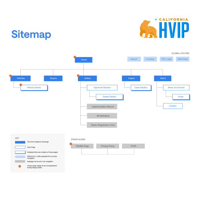
HVIP Sitemap
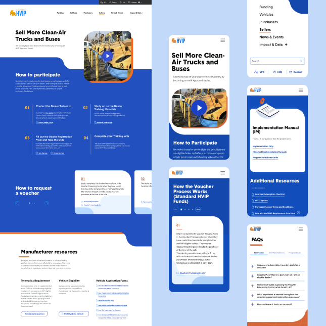
HVIP Mobile Screens
Content Hierarchy and Strategy

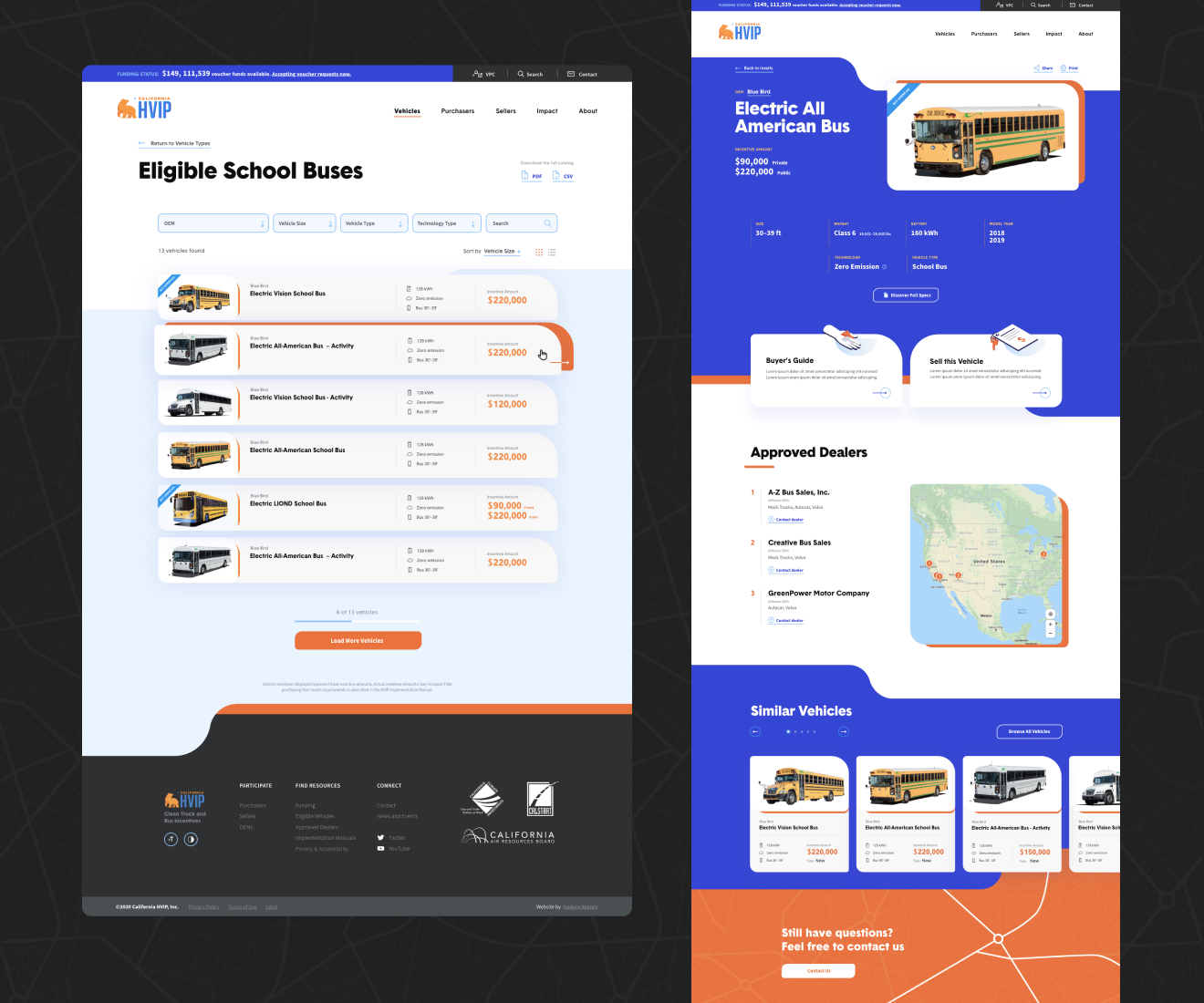
Our content team developed a methodical content hierarchy, strategy, and information architecture that streamlined the user experience. Distinct user journeys for dealers and purchasers were created to ensure each group could easily find relevant information. This simplified navigation consolidated important content and significantly reduced clutter. In the reorganized HVIP vehicle catalog, for instance, this is visible in the newly detailed product detail pages (PDPs). Users can find and act on information efficiently, via fewer clicks.  This strategic approach ultimately drives engagement and leads to more HVIP participation.

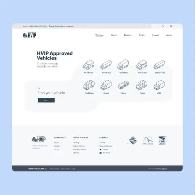
Wireframe 1
Vehicles Page 1
Page Design

Improving the HVIP website’s content organization had a powerful impact on the overall page design, making it more user-friendly and visually appealing.

Homepage Design

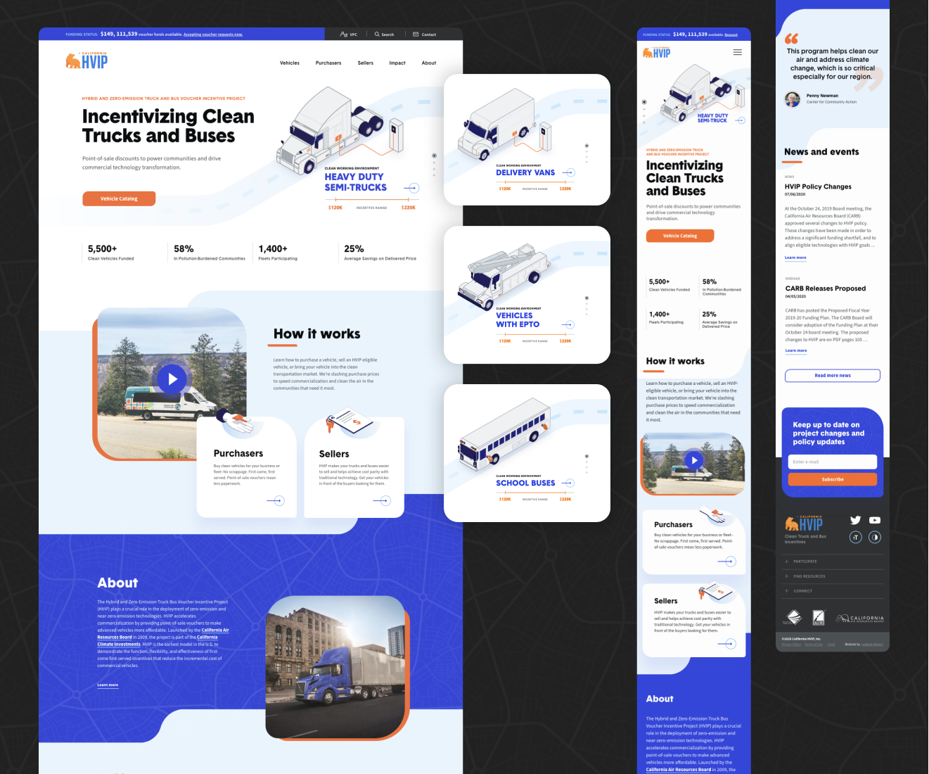
The new homepage immediately captures users’ attention by highlighting HVIP’s impact and program statistics. It features visually compelling data and testimonials from purchasers and vendors, all of which showcase the program’s success and positive social impact. By integrating bold visuals and clear calls to action, the homepage effectively guides users to explore further, significantly enhancing the initial user experience.

HVIP Mobile Screens and Desktop
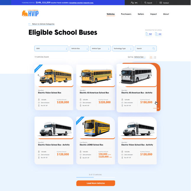
Vehicle Catalog

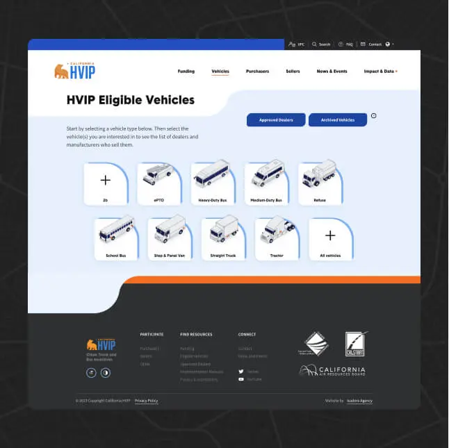
The vehicle catalog was the most extensive, intricate part of the HVIP website, and was meticulously redesigned to facilitate straightforward navigation and management. Our developers created a two-step setup that features both list and grid views, and allows users to easily select a vehicle type and then a manufacturer. The PDPs now include comprehensive information and dealer contact details, which allows users to find products most relevant to them and make informed decisions quickly. Overall, these updates streamline the browsing process, which keeps users engaged and reduces the bounce rate.

Program Information Pages

We overhauled pages dedicated to program information and presented detailed content in an organized and accessible manner. Implementing a clear content hierarchy with strategically placed CTAs efficiently guides users through the information while reducing distractions and highlighting the most important program details. Navigating these pages is now a seamless experience, and helps users find the information they most need with minimal effort.

HVIP Desktop Screens
Directory of Approved Vendors

Our team simplified the directory of approved vendors in order to improve usability for end-users and administrators. Now, users can search by vehicle or specification, which allows them to locate and contact vendors relevant to their needs. This improvement to the user experience supports industry stakeholders’ experiences, and helps them to benefit from what HVIP can offer them.

Administrative Interface

On the administrative side, our developers streamlined the content management system to be more intuitive and accessible. This included a built-in archive function and a simplified process for updating vehicle specifications and managing the vendor directory. These improvements ensure that HVIP team members, regardless of technical skill level, can efficiently manage the website, allowing for timely updates and maintenance.

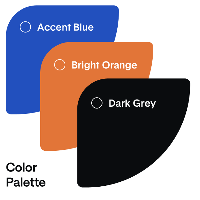
Color Palette 1
Frame 37880 1
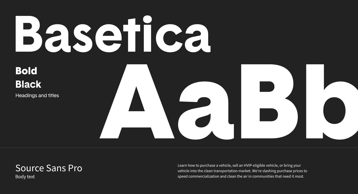
HVIP Font
Illustration & Animation 

Generous white space and custom isometric vehicle illustrations were used throughout the site to create a modern and clean look. Scroll-triggered animations, incorporated for statistical and impact-related data add a dynamic storytelling element. These visual design updates not only improve the website’s aesthetic appeal—they also make the content more digestible and engaging, and ultimately help improve user engagement.

Student Tour01 1
Student Tour03
HVIP Vehicles
Development and Accessibility

The HVIP website was built on a custom WordPress platform chosen for its flexibility and scalability. Our development team created flexible modules that allow administrators to quickly scale content and create new pages, ensuring the site can grow with HVIP’s needs. WordPress was an ideal solution for this content-based site due to its user-friendly interface, robust customization options, and extensive plugin ecosystem, which allows for easy updates and maintenance.

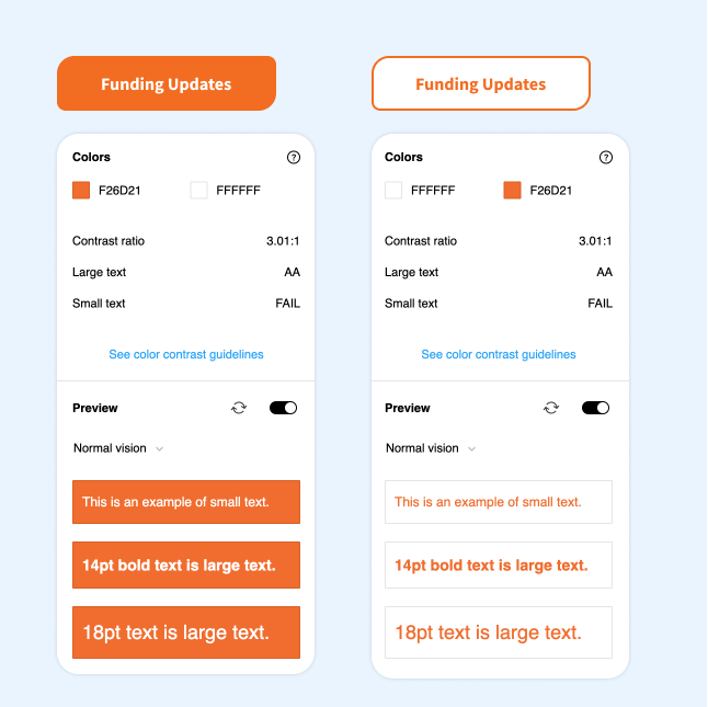
These extensive updates have transformed the HVIP website into one that meets accessibility requirements. The site now meets AA compliance guidelines, and plans are in place to achieve AAA conformance. These improvements ensure that the website meets state accessibility standards and is inclusive.

HVIP Accessibility
HVIP Bus PLP
Conclusion

The redesigned HVIP website, with its visual clarity, practical functionality, and user-friendly interface, stands as a powerful tool for HVIP and a testament to its positive impact on California’s commercial vehicle industry. This strategic design, coupled with deep industry understanding and user-centric research, positions the HVIP website as a valuable resource for years to come, instilling confidence in its continued success.

See more
TravelStore Putting Dream
Destinations in Reach
Belkin Business People-Inspired Tech Solutions